


(Case Study)
Publion
2026
Services
(Branding)
(Website)
(Development)
Intro
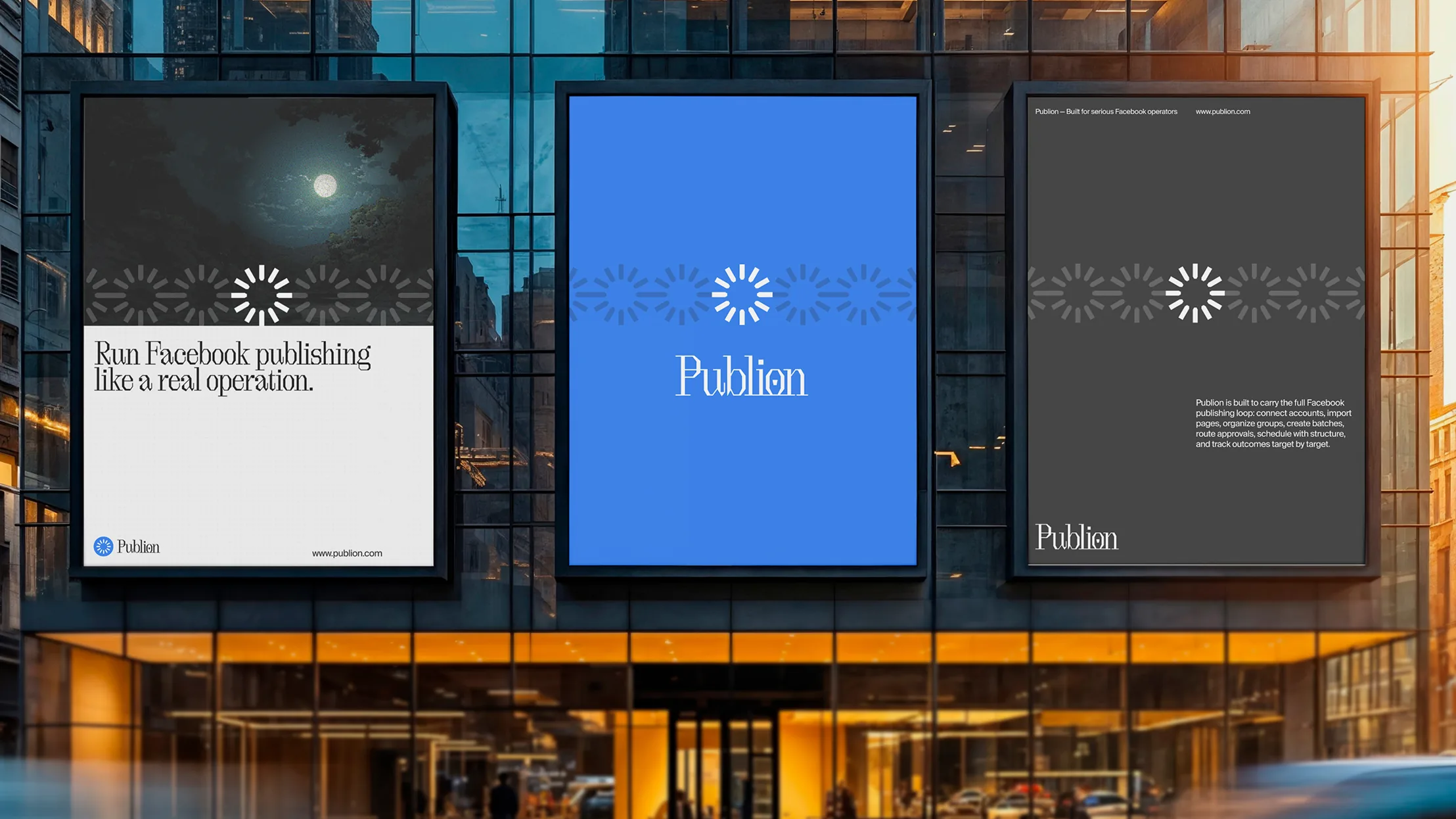
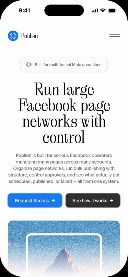
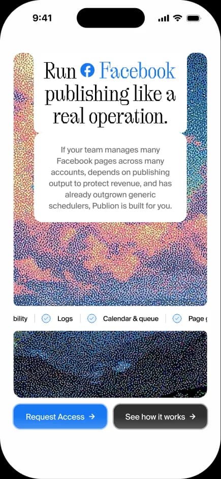
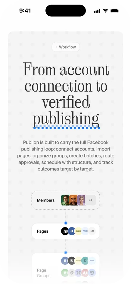
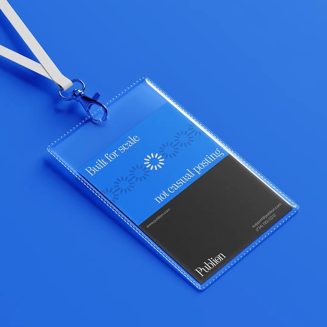
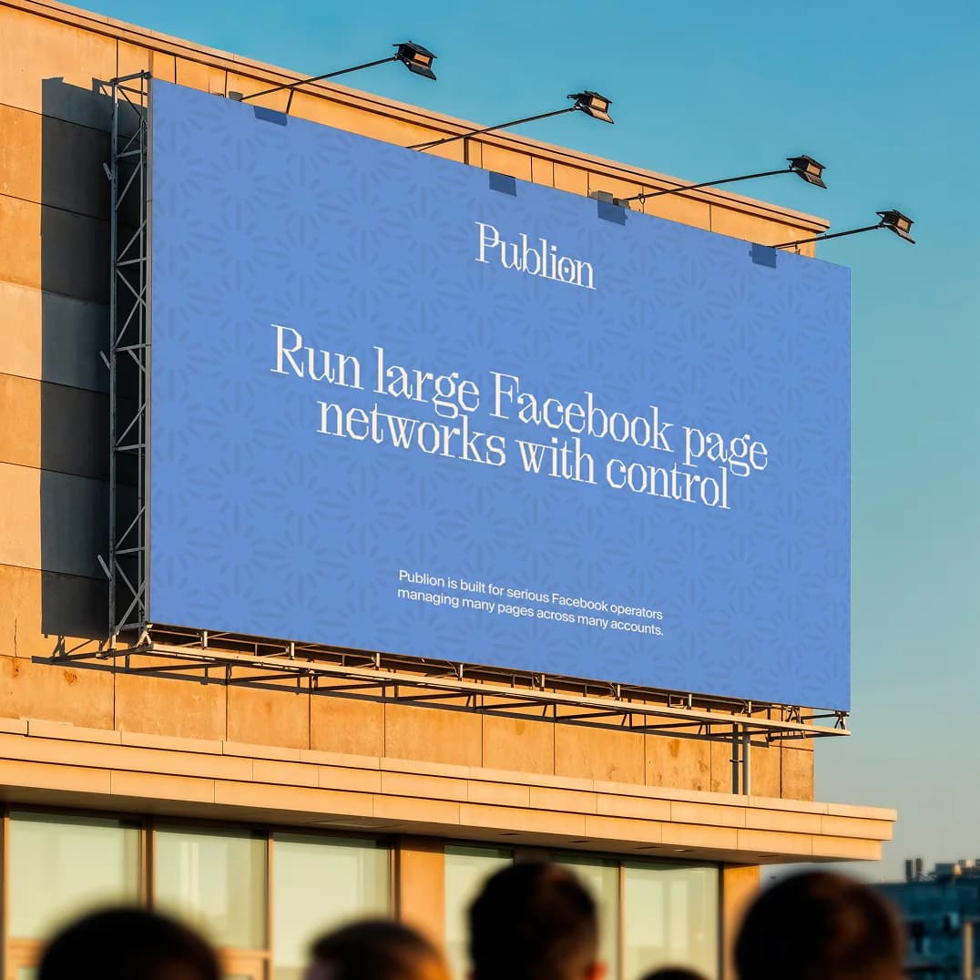
Publion is built for serious Facebook operators managing many pages across many accounts.
(Overview)
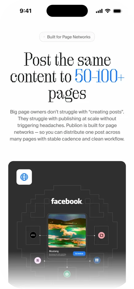
Organize page networks, run bulk publishing with structure, control approvals, and see what actually got scheduled, published, or failed - all from one system.
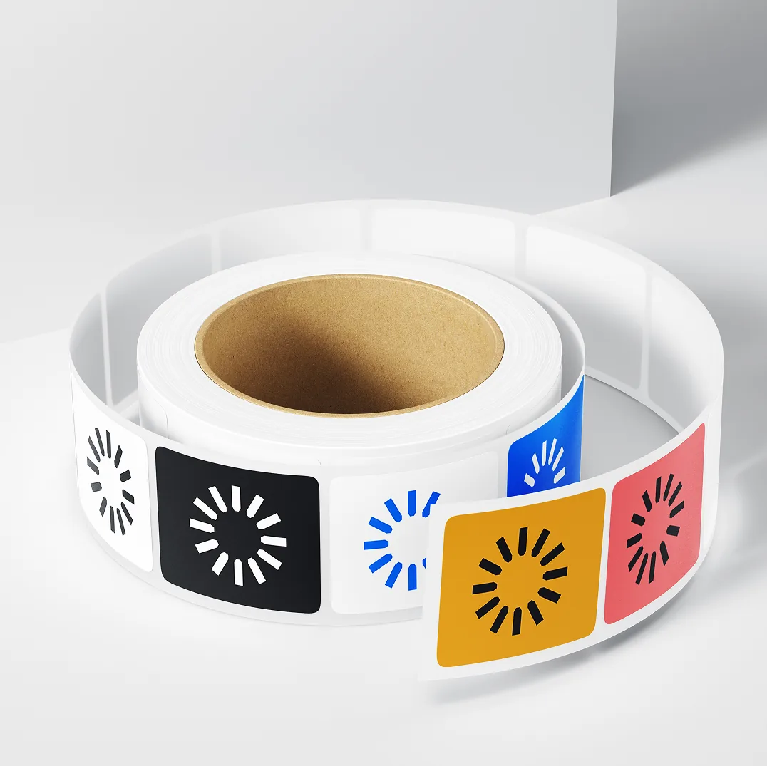
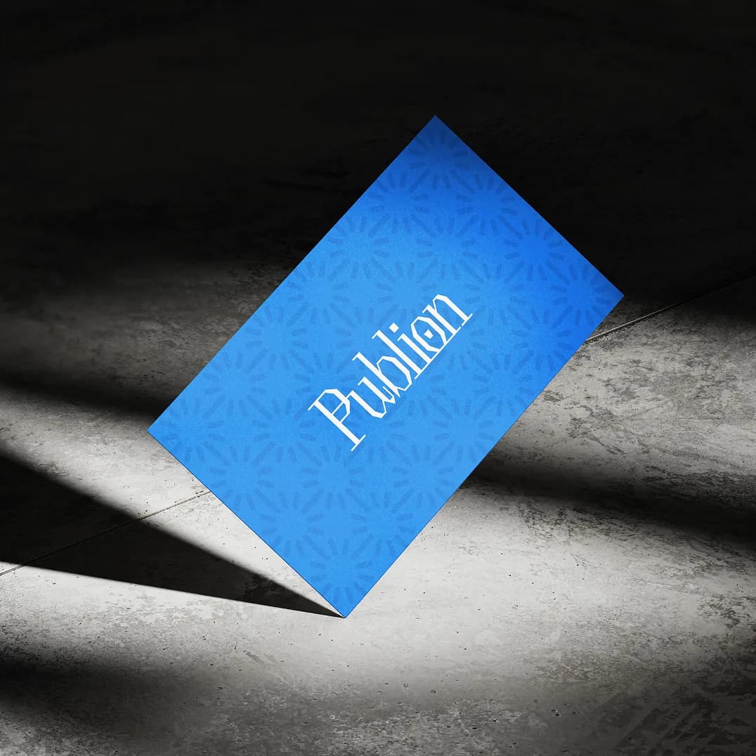


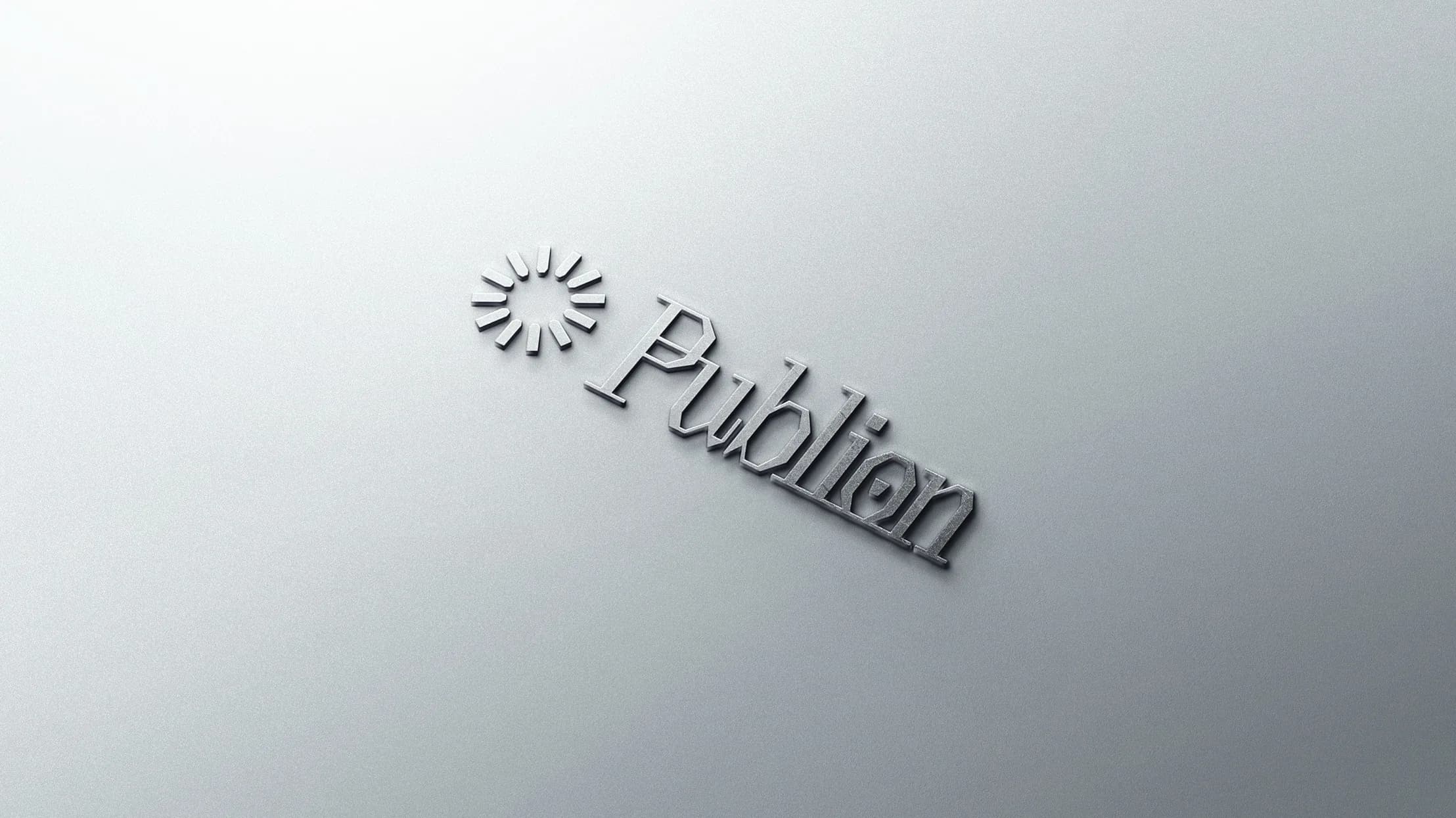
(Logo)
The Publion logo was designed to reflect structure, control, and operational clarity at scale. The symbol uses a circular system mark that represents continuous publishing flow, network distribution, and synchronized workflows across multiple Facebook pages.
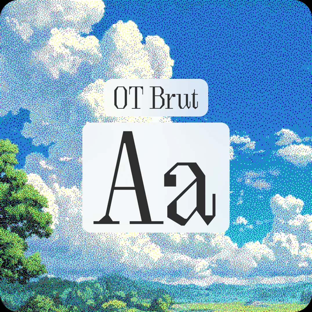
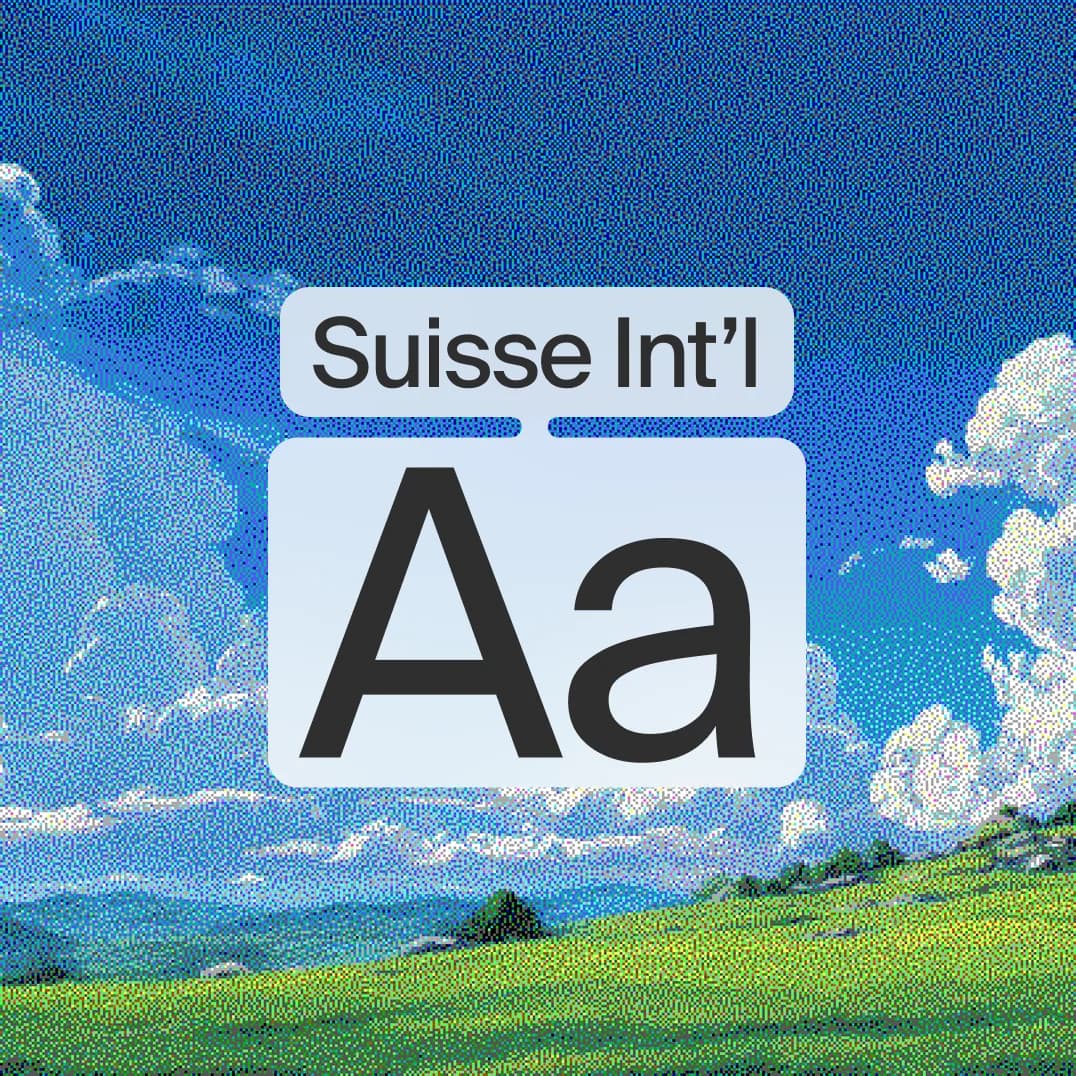
(Typography)
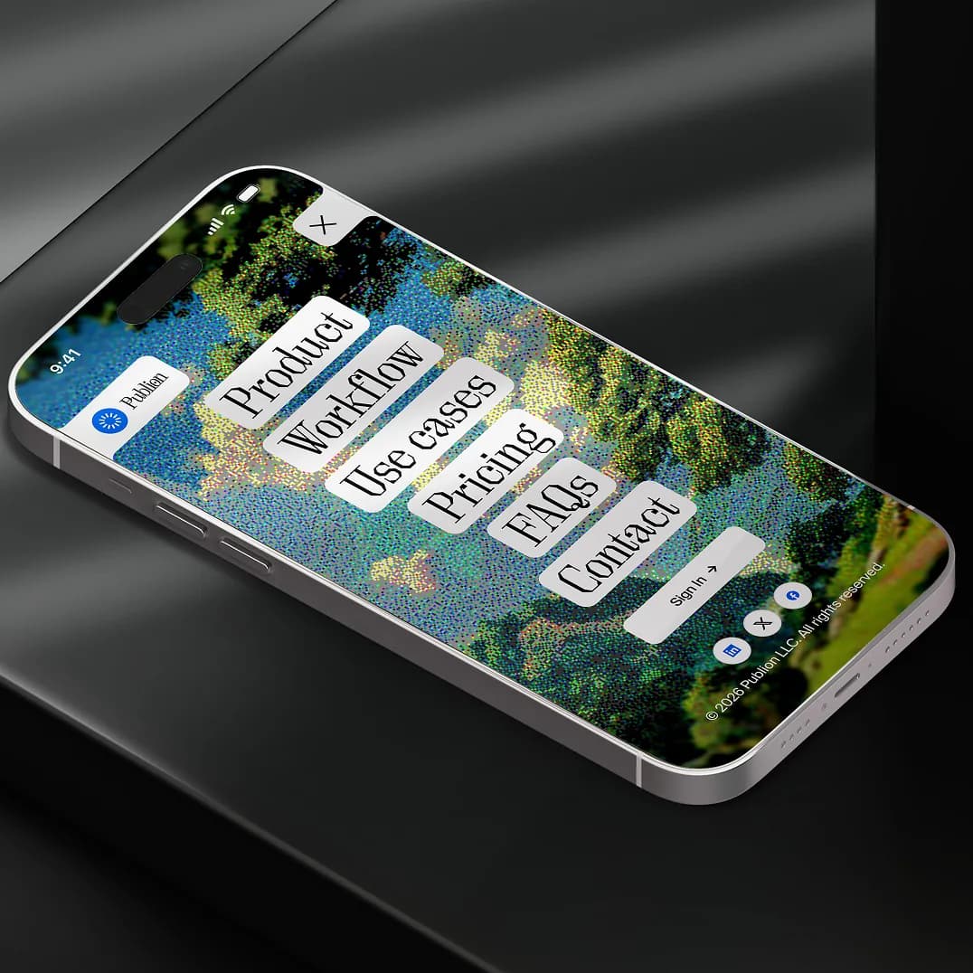
Publion's typography pairs OT Brut for bold brand expression with Suisse Int'l for clarity across the product interface. OT Brut brings a distinctive editorial character to headlines and key brand moments, while Suisse Int'l ensures clean readability across dashboards, UI elements, and supporting content.
(Imagery)
Publion's imagery system was designed to reflect the realities of operating large-scale Facebook publishing networks. Through natural landscapes, symbolic scenes, and quiet visual metaphors, each image represents concepts such as visibility, workflow control, approvals, publishing health, structure, and operational oversight.