(Case Study)
Helvetica
2025
Services
(Branding)
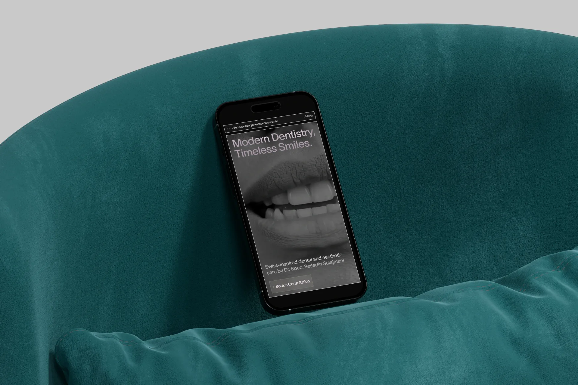
(Website)
(Development)
Intro
Helvetica is a space where sophistication meets care, and precision is at the core of everything

(Overview)
Every element, from the design to the treatments, is thoughtfully crafted with purpose and attention to detail, creating an environment where patients feel both comfortable and valued.


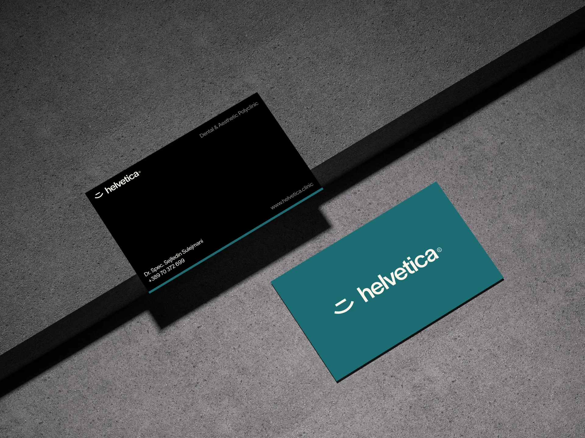
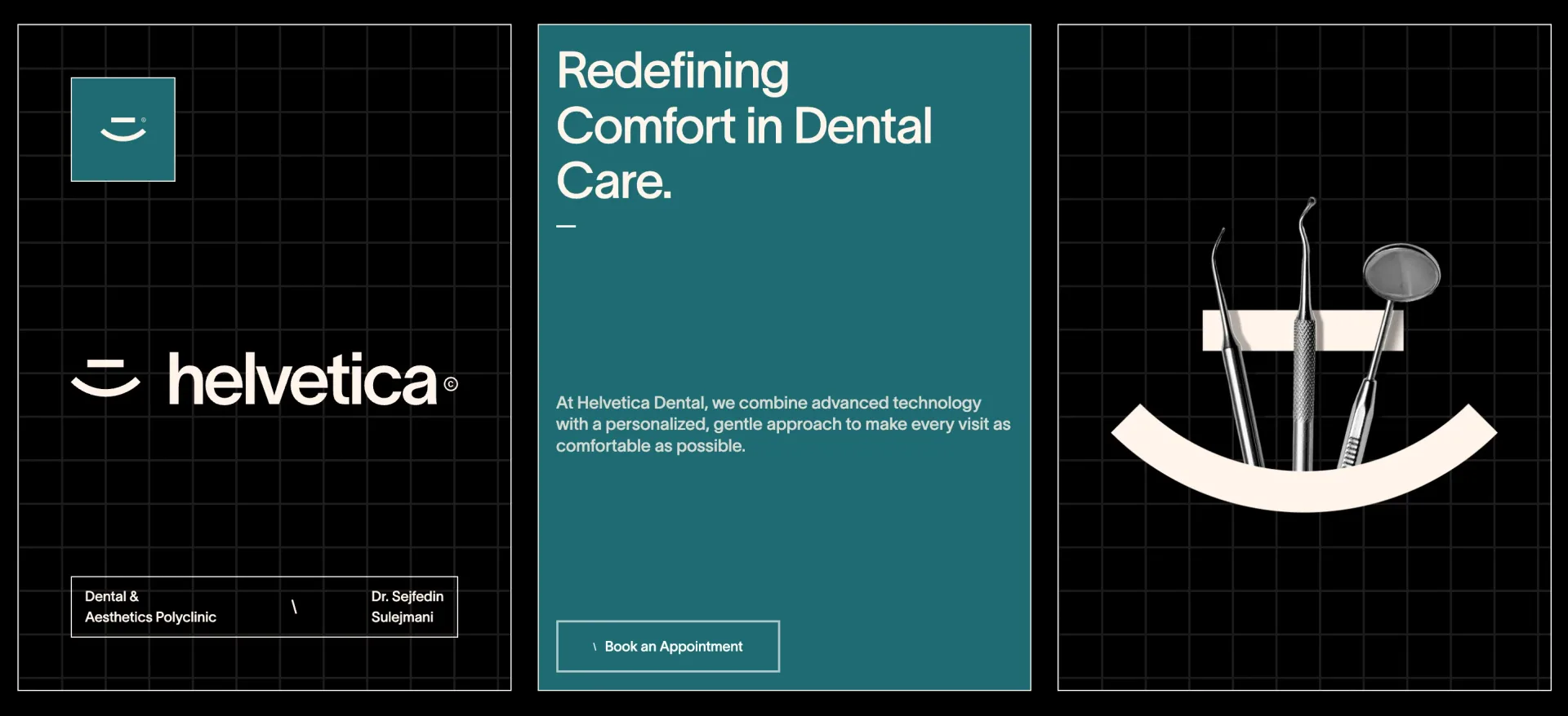
(Logo)
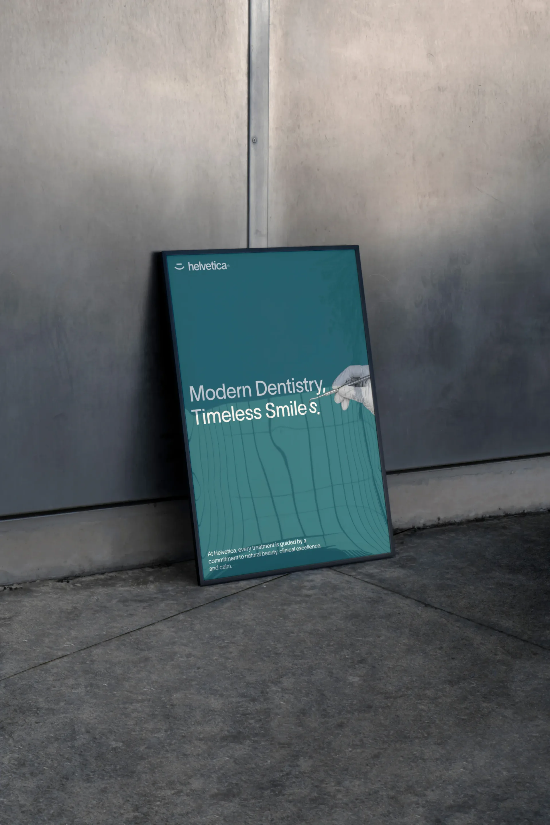
The Helvetica logo is a refined expression of the brand’s identity. Built from a smile and a horizon line, it reflects comfort, precision and modern approach to dental care.


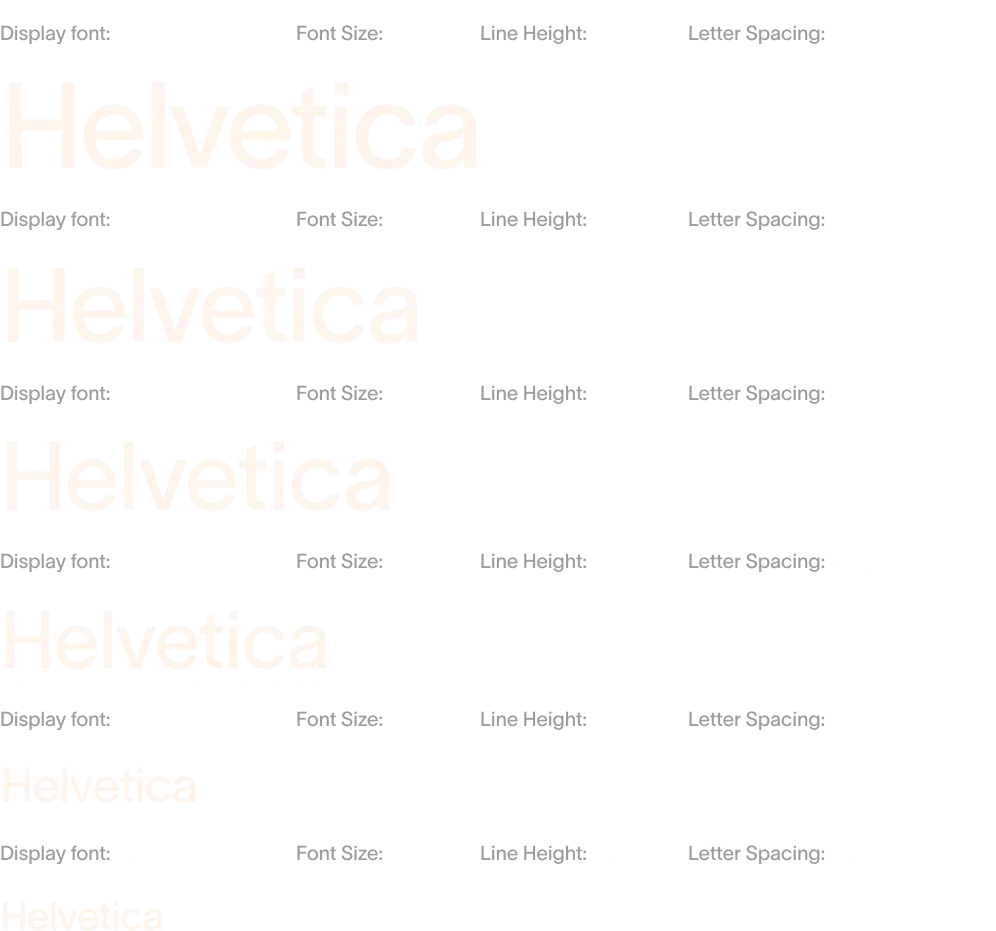
(Typography)
Helvetica’s typography is where much of the brand’s refinement truly comes to life. Chosen for its elegant structure, balanced proportions, and beautifully controlled spacing, it gives the identity a sense of clarity that feels both elevated and effortless.

(Imagery)
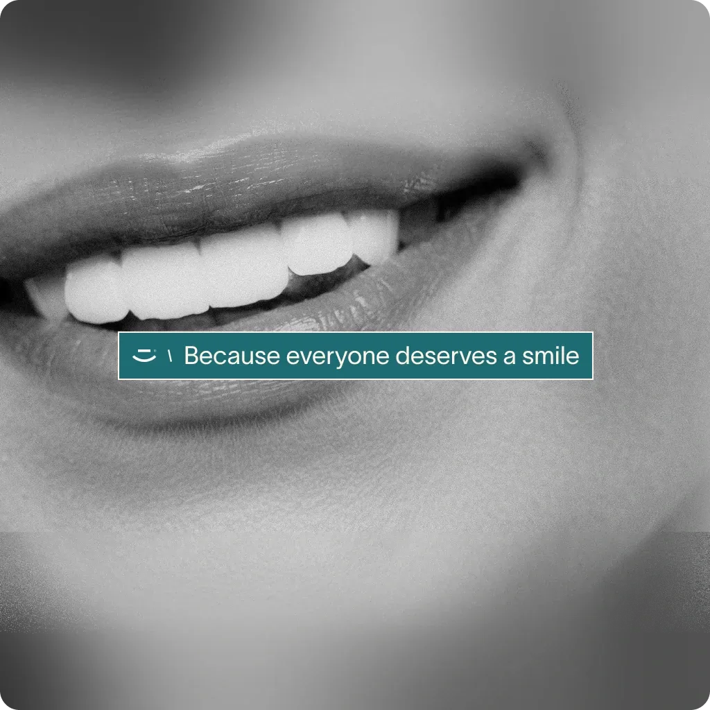
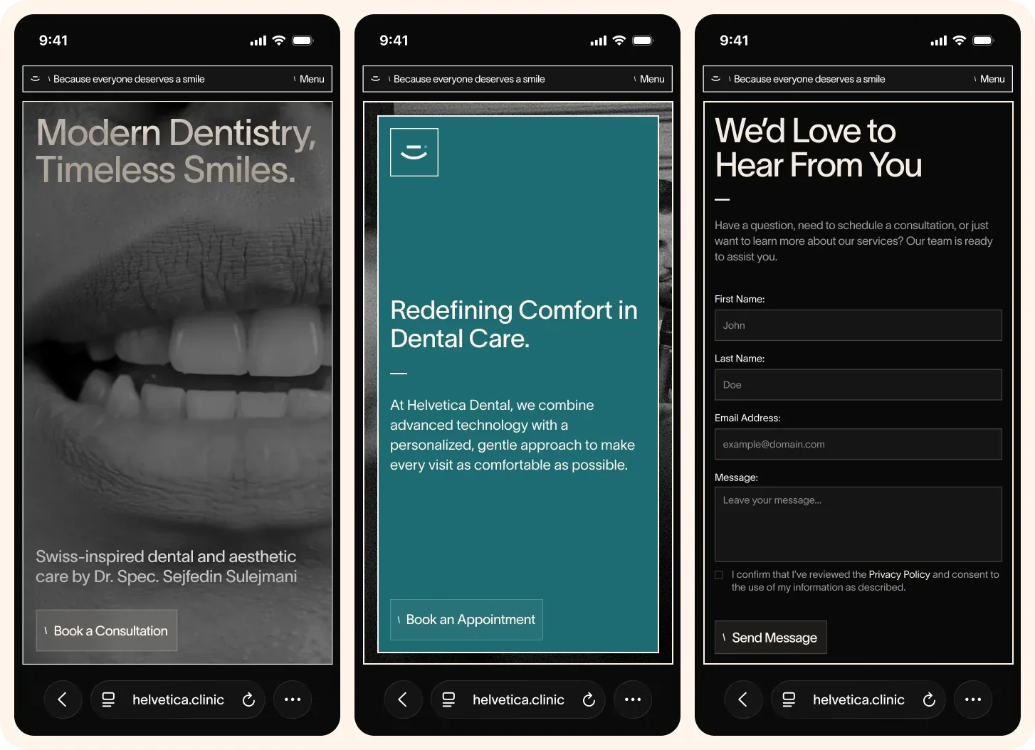
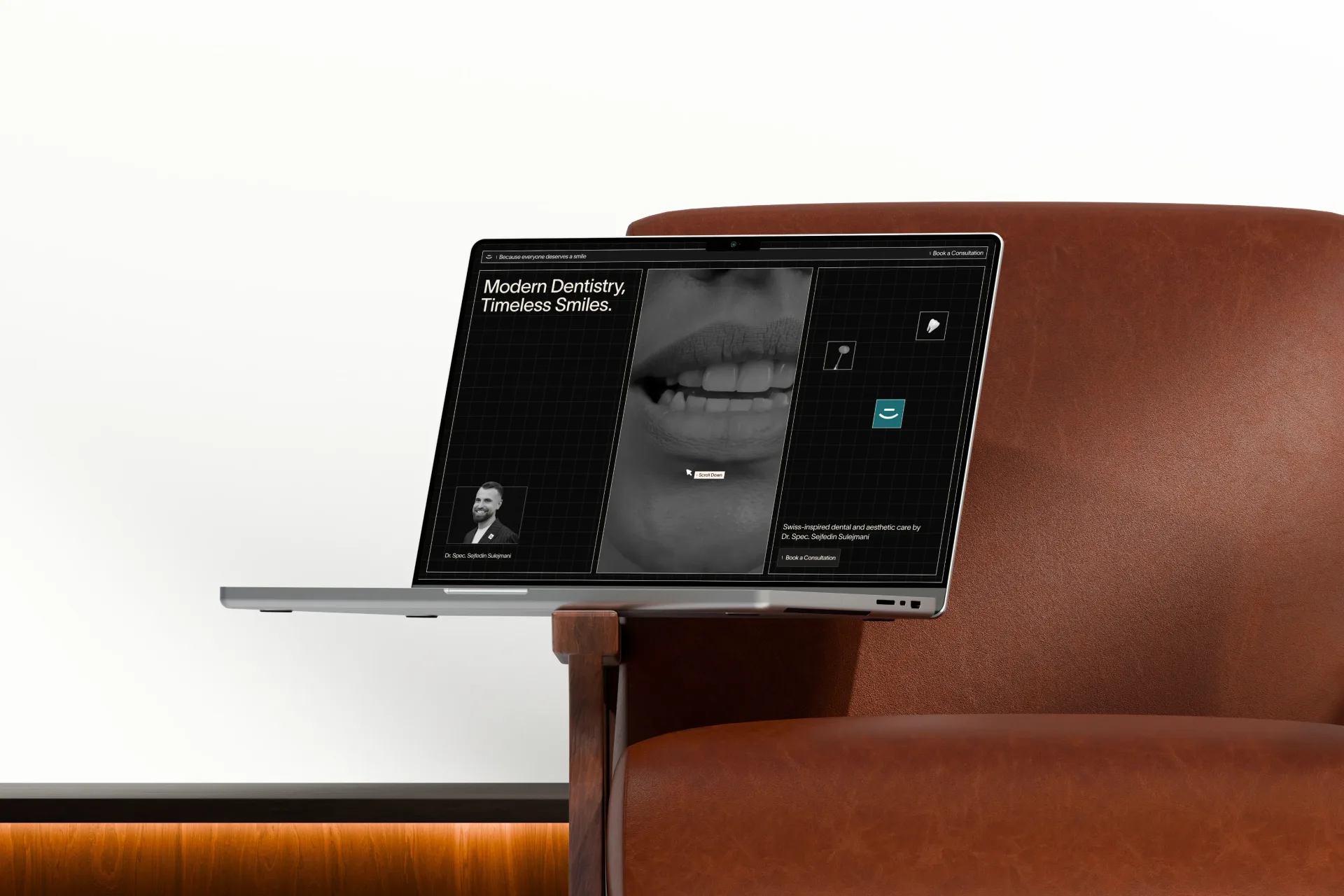
Helvetica’s imagery strips away distractions, drawing attention to the brilliance of every smile. Light and shadow sculpt each detail, revealing form, texture, and precision with intention.