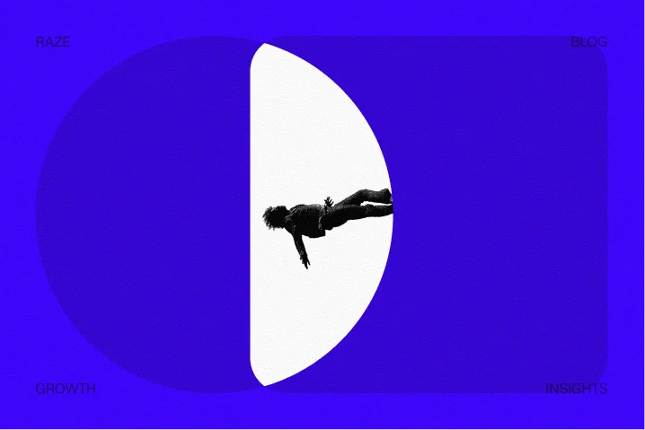
TL;DR
SaaS branding trends 2026 are shifting away from generic flat design toward motion, depth, and product-led storytelling. The winning approach is not more visual flair. It is using interaction and layered brand systems to improve clarity, trust, AI citation potential, and conversion.
Minimalist flat design is losing its edge in SaaS because too many brands now look interchangeable at the exact moment buyers need clarity and trust. In 2026, the stronger pattern is not visual excess. It is deliberate motion, layered depth, and product-led storytelling that help a company explain value faster and convert more of the traffic it already has.
A useful way to frame SaaS branding trends 2026 is simple: static websites explain less than dynamic ones when the product itself is complex. Brand is no longer just a style system. It is the interface between market understanding, AI citation, buyer confidence, and conversion.
Why flat SaaS brands are starting to underperform
For years, flat minimalism solved a real problem. It reduced clutter, improved load speed, and made digital products feel modern. But once a design pattern becomes default, it stops creating distinction.
That is the issue many SaaS teams are facing now. The standard formula is still common: pale gradients, generic illustrations, one-line value props, a dashboard screenshot, and a CTA above the fold. It looks acceptable, but it does not communicate enough. It also does little to support the new funnel most teams now depend on: impression to AI answer inclusion to citation to click to conversion.
This matters because crowded markets punish generic presentation. When multiple tools promise automation, insights, workflow efficiency, or team productivity, the buyer is not deciding on feature lists alone. The buyer is deciding whether the company seems credible, clear, and specific.
According to SaaSFrame’s 2026 landing page trend analysis, high-performing SaaS pages are moving toward story-driven hero sections, purposeful micro-animations, and immersive product previews. That shift is less about aesthetics than information density. Motion and depth help a brand show sequence, cause-and-effect, and product context without forcing the visitor to read a wall of copy.
The same pattern shows up in growth work. Teams usually do not redesign because they are bored with the current look. They redesign because one of four things is happening:
- traffic is arriving, but conversion is weak
- positioning is still vague after product progress
- paid acquisition is expensive, so every page needs to work harder
- internal teams cannot align brand, design, and growth fast enough
Those are business problems first. Design becomes the lever only when it clarifies the offer, reduces friction, and improves the economics of acquisition.
This is also why flat design fatigue is dangerous for founders. A website can look clean and still fail its job. Raze has covered related conversion issues in this breakdown of why startup websites fail and in its guide to high-converting SaaS websites. The common thread is that visual polish without positioning depth rarely produces measurable lift.
What “motion and depth” actually mean in a SaaS buying journey
Motion and depth are easy to misuse because both terms can sound like surface-level trends. In practice, they refer to a tighter relationship between narrative, interface, and buyer intent.
Motion means purposeful change over time. It can be a product preview that demonstrates workflow, a hover state that reinforces hierarchy, or a short animation that explains a before-and-after state. The key word is purposeful.
Depth means the brand feels layered rather than flat. That can come from spatial hierarchy, product context, richer visual systems, dynamic content modules, or a stronger connection between messaging and product reality.
The change is visible across 2026 sources. JetBase’s 2026 SaaS design review points to micro-interactions and gamification as increasingly important parts of engagement and stickiness. SaaS Hero’s 2026 landing page trend report describes a move toward product-led stories rather than generic value statements. The Smarketers’ 2026 marketing trends analysis also highlights hyper-personalization and dynamic value propositions as a response to AI-first buyer behavior.
Taken together, these shifts suggest a practical rule: if a SaaS product is dynamic, the brand experience should not remain static.
The point of view that matters most
Do not add motion to make the site feel modern. Add motion to explain what the product changes, for whom, and in what sequence.
That stance is important because many redesigns fail when teams confuse novelty with clarity. A moving hero is not useful if the visitor still cannot answer basic questions within a few seconds: What does this tool do? Who is it for? Why switch now? What outcome should be expected?
A simple model: the four-layer brand depth review
A practical way to evaluate SaaS branding trends 2026 without chasing visual fashion is the four-layer brand depth review:
- Message layer: Is the value proposition specific enough to matter?
- Evidence layer: Does the page show proof, workflow, trust, or outcomes?
- Interaction layer: Does motion reveal useful information or just decorate?
- Conversion layer: Does the brand system support the next step with low friction?
If one of those layers is weak, motion alone will not help. If all four are aligned, brand starts functioning like a growth asset rather than a design exercise.
The hero section is becoming a product story, not a billboard
One of the clearest signs in SaaS branding trends 2026 is the decline of the static hero image. The old approach treated the hero as a billboard. The newer approach treats it as a compressed product story.
That means the best hero sections now do more than announce a category. They show context, movement, and the job-to-be-done. According to SaaSFrame, story-driven hero sections are replacing static visuals because they help users understand product value faster.
For operators, the implication is direct. The hero has to carry more explanatory weight than it did two years ago. AI summaries, comparison queries, and skeptical buyers have reduced patience for abstraction.
A stronger hero usually includes:
- a value proposition tied to a specific pain or workflow
- a product visual that shows sequence, not just interface chrome
- one immediate trust signal such as customer proof, integration context, or use-case specificity
- a CTA matched to buying temperature
A concrete before-and-after redesign pattern
A useful baseline looks like this:
- headline: “Automate your workflows”
- subhead: broad promise with no category specificity
- visual: static dashboard screenshot
- CTA: “Book demo”
The intervention is not just visual. It is narrative.
A stronger replacement looks like this:
- headline: names the exact workflow and user type
- subhead: explains the trigger, process, and measurable business outcome
- visual: short motion loop showing data entering, routing, and resolving a real task
- CTA: matched to intent, such as “See how routing works” for colder traffic or “Talk to a specialist” for higher-intent pages
The expected outcome is better comprehension before the click. The measurement plan should include baseline hero engagement, scroll depth, CTA CTR, assisted conversion rate, and qualified demo rate over a 4-6 week testing window using tools such as Google Analytics, Mixpanel, or Amplitude.
This is also where many teams miss the link between brand and CAC. A more explanatory hero can reduce wasted paid traffic because fewer visitors bounce before understanding the offer. That principle lines up with SaaS Hero’s view that product-led storytelling supports more capital-efficient growth.
Micro-interactions work when they reduce cognitive load
Micro-interactions often get pitched as polish. In practice, their real job is to help the visitor understand system behavior.
That is why the strongest examples are usually small. A pricing card expands to show what changes at each tier. A workflow module animates to reveal sequence. A testimonial carousel pauses at the right moment instead of racing past useful proof. A navigation state helps the user understand where they are and what comes next.
JetBase identifies micro-interactions as a core design direction in 2026, and that makes sense in SaaS environments where product value depends on demonstrating process, not just listing features.
The contrarian stance here is simple: do not animate everything. Animate the moments where uncertainty is highest.
That tradeoff matters. Too much motion weakens hierarchy, increases implementation overhead, and can hurt performance if teams rely on heavy assets. Too little motion can leave a complex product feeling lifeless or hard to decode.
The middle-section checklist teams can actually use
When reviewing a landing page or homepage, ask these five questions in order:
- Where does a buyer hesitate first? Usually this is the hero, pricing context, product proof, or integration trust.
- What would be easier to show than explain? Workflow sequence, onboarding steps, analytics visibility, or automation logic usually belong here.
- Which interactions support comprehension? Hover reveals, scroll-triggered storytelling, and short product loops often help.
- What must stay static for speed and hierarchy? Headlines, primary CTA placement, legal trust signals, and structural navigation usually should not compete with motion.
- How will impact be measured? Define baseline metrics before release, then review engagement and conversion by section.
This checklist is intentionally basic. It works because most motion decisions should be governed by buyer friction, not by design trend decks.
For teams investing in paid traffic, this also intersects with page readiness. Raze explored the economics of that problem in its article on turning traffic into revenue. If motion increases attention but weakens conversion clarity, the page gets more expensive, not more effective.
The technical guardrails behind motion
Motion design for marketing pages needs technical discipline.
A few constraints matter more than the animation style itself:
- keep motion lightweight and avoid large autoplay assets when a short loop or Lottie-style sequence can communicate the same idea
- preserve accessibility with reduced-motion preferences
- instrument key interactions as events rather than assuming movement equals engagement
- test mobile behavior separately because sequence-heavy sections often break on smaller screens
- ensure SEO-critical content remains indexable and not trapped inside scripts or hidden interactions
For AI-answer citability, this is especially important. If the page becomes visually impressive but semantically thin, it may still look strong to humans while giving little useful structure to crawlers, summarizers, or answer engines.
Personalization is pushing brand systems beyond templates
Another reason flat design is losing ground is that SaaS buyers now expect pages to adapt more intelligently to context. Generic presentation feels lazy when tools can personalize by industry, role, traffic source, or problem state.
The Smarketers argues that hyper-personalization and dynamic value propositions are becoming essential as AI-first buying behavior changes expectations. That has direct implications for brand systems.
A static visual identity built around one homepage aesthetic is less useful than a modular identity that can flex across:
- vertical-specific landing pages
- partner or integration pages
- paid campaign variants
- ABM pages for named accounts
- lifecycle pages for expansion or reactivation
This is where depth becomes operational, not decorative. A deeper brand system includes visual modules, message variants, and product proof components that can adapt without breaking consistency.
What this looks like in real production
A practical brand system for 2026 usually includes:
- a core messaging hierarchy for category, persona, and use case
- a visual motion library for product previews, transitions, and proof blocks
- component rules for pages with different intent levels
- event tracking plans for interactive sections
- content governance so sales, growth, and product teams are not publishing conflicting stories
That structure matters when a company is scaling go-to-market quickly. Ardas IT’s 2026 SaaS trend analysis highlights the broader shift from feature velocity toward infrastructure capable of supporting real-time data and workflow orchestration. The same idea applies on the front end. If the product is becoming more dynamic and data-aware, the brand layer needs enough depth to reflect that complexity without becoming confusing.
There is also a citation benefit. In an AI-answer environment, pages that express a clear point of view, show real workflow context, and publish reusable explanations are easier to cite than pages that rely on abstract slogans. Brand becomes part of discoverability because clarity and structure improve both trust and recall.
What founders should change first if the brand feels generic
Most teams do not need a full visual overhaul on day one. They need to identify where the current brand is leaking revenue or slowing go-to-market.
A practical sequence is:
Start with conversion friction, not aesthetics
Review the highest-intent pages first. That usually means homepage, paid landing pages, core solution pages, and demo-request paths.
Find where users stall:
- low CTA CTR from hero modules
- high bounce on paid traffic pages
- shallow scroll depth on core commercial pages
- weak conversion rate despite decent traffic quality
One useful benchmark to keep in mind is that Raze’s analysis of SaaS website conversion patterns points out how little room there is for complacency. When baseline conversion is already modest, vague branding carries real cost.
Rebuild proof before rebuilding visuals
If the site lacks strong product evidence, customer proof, or workflow clarity, richer visuals alone will not save it.
The order should be:
- tighten positioning n2. define page-level conversion goals
- identify which product moments deserve motion
- build proof modules around those moments
- redesign the visual system around the stronger story
That sequence protects speed and reduces expensive rework.
Test one depth layer at a time
The safest way to move beyond flat design is not a full relaunch. It is staged change.
A sensible rollout often starts with:
- hero motion loop on one high-intent page
- one interactive product story section
- one upgraded trust block with clearer evidence
- one personalized variant for a high-value audience segment
Then measure.
The key metrics are usually:
- visitor-to-demo conversion rate
- qualified pipeline from key pages
- CTA CTR by section
- time to first meaningful interaction
- assisted conversion by traffic source
This staged approach respects the founder tradeoff between speed and perfection. It also makes it easier to determine whether motion is clarifying the offer or just increasing production complexity.
Common mistakes teams make when chasing 2026 design trends
The risk in any design cycle is confusing visible trends with useful patterns. SaaS branding trends 2026 are real, but copying the surface without the logic underneath usually creates expensive noise.
Mistake 1: replacing clarity with atmosphere
Layered gradients, motion, and immersive sections can create emotional lift. But if the page still hides the category, audience, or use case, conversion will suffer.
The fix is simple: every visual element should answer a buyer question or support the next action.
Mistake 2: treating product screenshots as proof
A dashboard image alone is not proof. It is only interface evidence.
Proof is stronger when it shows sequence, context, and outcome. That is why short workflow previews, customer-specific use cases, and interaction-led explanations perform better than static UI dumps.
Mistake 3: shipping motion without instrumentation
If no one tracks scroll completion, interaction rates, or downstream conversion, the team cannot tell whether motion helped.
Every important motion block should be measurable in Google Analytics, Mixpanel, or Amplitude. Otherwise, brand discussions drift back into opinion.
Mistake 4: forcing personalization before the message is strong
Dynamic headlines and adaptive content are useful only after the core proposition is already clear.
A weak message personalized 20 different ways is still weak.
Mistake 5: ignoring the citation layer
This is newer, but increasingly important. Pages should not only look differentiated. They should be structured to be quoted and cited.
That means including concise definitions, strong section logic, specific examples, and a clear point of view that can survive outside the page. Raze has covered adjacent dynamics in its SaaS GTM playbook and in its budget-conscious GTM guide. The broader principle is the same: clearer narrative reduces wasted motion across the funnel.
The financial lens behind better SaaS branding in 2026
Brand discussions often become subjective because teams review them in design terms rather than in operating terms. The more useful view is financial.
Motion and depth are worth funding when they improve one or more of the following:
- conversion rate on existing traffic
- trust and comprehension on first visit
- speed to market for campaign pages and launches
- sales efficiency through clearer positioning
- reduced internal load because design, development, and marketing operate from one system
That is also how experienced operators should think about common SaaS finance questions that show up in trend-related searches.
The Rule of 40 is a SaaS benchmark that combines growth rate and profit margin to evaluate business health. It is useful for management and investor conversations, but it should not be used as a direct branding KPI.
The 10x rule in SaaS is usually shorthand for delivering an improvement that feels materially better than the next-best alternative, not just marginally nicer. In branding terms, that means a site should create a meaningfully better understanding of product value, not just a nicer visual impression.
The 3-3-2-2-2 rule of SaaS is not a standard branding framework and is interpreted inconsistently across different contexts. For decision-making, founders should be careful about forcing brand work into borrowed operating heuristics that were not designed for website conversion or positioning.
The stronger operating principle is simpler: if branding changes do not improve comprehension, trust, or conversion efficiency, they are not strategic yet.
FAQ: what teams are asking about SaaS branding trends 2026
What are the branding trends in 2026 for SaaS?
The clearest pattern is a move from generic flat minimalism toward motion, layered depth, and product-led storytelling. Sources such as SaaSFrame, JetBase, and SaaS Hero all point to more interactive, explanatory, and personalized experiences.
Is minimalism dead for SaaS websites?
No. Minimalism still matters when it protects hierarchy, speed, and readability. What is fading is empty minimalism, where simplicity removes the very context a buyer needs to understand a complex offer.
Does motion help conversion, or just engagement?
It can help conversion when it reduces uncertainty at key decision points. The safest test is to apply motion to sections where visitors hesitate, then measure CTA CTR, qualified conversion rate, and downstream pipeline impact over a set window.
How should a founder prioritize a branding refresh in 2026?
Start with pages closest to revenue. Audit homepage, paid landing pages, and solution pages for message clarity, evidence quality, and friction before investing in a complete visual overhaul.
What should teams measure after moving beyond flat design?
Track section-level interaction, scroll depth, CTA CTR, visitor-to-demo conversion, and qualified pipeline by traffic source. If those metrics do not improve, the redesign may have increased visual complexity without improving buyer understanding.
Want help applying this to your business?
Raze works with SaaS teams that need sharper positioning, faster execution, and marketing sites built to convert, not just look current. Book a demo to talk through your next growth move.
References
- SaaSFrame: 10 SaaS Landing Page Trends for 2026 (with Real Examples)
- JetBase: SaaS Design: Trends & Best Practices in 2026
- SaaS Hero: Top Landing Page Design Trends for B2B SaaS in 2026
- Ardas IT: SaaS 2026 Trends: From AI Experiments to Production-Ready Platforms
- The Smarketers: SaaS Marketing Trends 2026: AI-First Strategies