
Lav Abazi
9 articles
Business, strategy, growth, positioning, marketing leadership, pricing, sales, and operational topics
Learn how to build a high-conversion SaaS website with 7 lessons on structure, messaging, proof, and page design that drive more trials.
Written by Lav Abazi, Mërgim Fera, Ed Abazi
TL;DR
A high-conversion SaaS website wins with clarity, proof, and page paths that match buyer intent. Start with stronger structure, build beyond the homepage, use integration and persona pages, and measure every change against trial or demo conversion.
Most SaaS websites do not fail because the product is weak. They fail because the site asks a cold visitor to make a leap the page has not earned.
A high-conversion SaaS website does one job better than an average one: it reduces uncertainty fast enough that the right visitor keeps moving. That sounds simple, but in practice it changes how you write, design, structure, instrument, and ship the entire site.
The biggest mistake I see is treating the website like a brand artifact instead of a sales surface. Teams spend weeks polishing visuals, then wonder why paid traffic bounces, demo intent stays flat, and sales says leads are unqualified.
A high-conversion SaaS website is not a prettier website. It is a clearer one with stronger proof and less friction.
That idea lines up with what Stan Vision describes as the real drivers of SaaS conversion: clarity, proof, and momentum. Not novelty. Not clever copy. Not motion for its own sake.
This matters more in 2026 because the funnel has changed. More buyers now discover brands through summaries, recommendations, and AI-generated answers before they ever land on your homepage. So the site has to do two jobs at once:
Be easy for humans to trust.
Be specific enough to be worth citing.
That is why vague positioning is expensive. If your homepage says you are an "all-in-one platform for modern teams," nothing sticks. AI tools cannot cite it cleanly. Buyers cannot repeat it internally. Sales cannot use it to qualify.
The sites that win tend to follow a simple pattern I use in audits: promise, proof, path, push.
Promise: what the product helps someone achieve.
Proof: why that claim should be believed.
Path: how the product fits the buyer's world.
Push: the next step with minimal friction.
If one of those is weak, conversions leak.
This is also where a lot of redesigns go wrong. Teams jump to visual execution before deciding which commercial problem the site needs to solve. Is the goal more self-serve trials? Better demo requests? Higher-intent paid traffic? Clearer qualification for enterprise buyers? Different answers require different page systems.
For founders and growth leads, this is the uncomfortable tradeoff: speed matters, but random speed creates expensive rework. A website redesign without a conversion thesis is just design debt with a launch date.
If the baseline is unclear, start there. Raze has written before about why many startup sites fail and why redesigns underperform when positioning and conversion logic are still fuzzy.
A lot of teams try to solve conversion with isolated fixes. They rewrite the hero. Add logos. Swap screenshots. None of that helps much if the page sequence itself is wrong.
One useful structural reference comes from a Reddit framework on high-converting SaaS landing pages, which lays out a 9-section flow that starts with a hero and moves immediately into pain point or transformation language. That ordering matters because visitors are not asking, "Is this well designed?" They are asking, "Is this for me, and why should I care right now?"
In practice, the strongest homepage architectures usually include these core sections:
A hero with one clear promise and one clear CTA.
A pain, stakes, or transformation section right below the fold.
Product proof through visuals, workflow, or outcomes.
Trust signals such as customer logos, testimonials, or quantified claims when available.
Objection handling around implementation, integrations, security, or switching cost.
Deeper use cases or persona paths.
A CTA that matches buying intent.
That does not mean every site needs all nine sections from that community framework, in that exact order, on one page. It means the logic should be there.
When I review a SaaS homepage, I look for five answers in the first minute:
What is this?
Who is it for?
Why is it better or different?
Can I trust it?
What should I do next?
If any answer is delayed, the page is making the visitor work.
A common pattern on weak pages is this sequence: vague hero, abstract product language, feature grid, then a CTA. That is backwards. The buyer has not seen enough evidence to deserve a CTA yet.
A stronger sequence goes like this: strong promise, clear buyer context, visual explanation, trust layer, then CTA. That is one reason Unbounce's review of SaaS landing pages keeps returning to essentials like USP, benefits, social proof, and a clean call to action.
The hero matters, but it is usually overestimated.
I have seen teams spend ten rounds refining one line of copy while ignoring the sections that actually reduce risk. If your product has a non-trivial implementation, multi-person buying committee, or category confusion, the hero will never do all the work.
The hero should create forward motion, not close the deal.
That means your above-the-fold area should typically include:
A sharp headline tied to an outcome
A subhead that adds buyer context or mechanism
One primary CTA
A product visual that explains, not decorates
Optional lightweight proof if it supports the claim
If the page gets meaningful paid traffic, pair this with proper instrumentation in Google Analytics or your analytics stack so you can isolate hero CTA clicks, scroll depth, and downstream trial or demo completion. Without that, teams argue from taste.
For a deeper look at section order and messaging, this pairs well with our guide to high-converting SaaS websites and our landing page conversion breakdown.
Most of the conversion gain on a high-conversion SaaS website comes from four moves that are strategically boring and commercially powerful.
Clarity beats cleverness, especially in crowded markets.
The best pages cut jargon and compress the value proposition until a buyer can repeat it after one read. That sounds obvious, but many SaaS teams still hide behind category language because it feels safer than making a specific claim.
A useful contrarian rule here: do not write for everyone who could buy. Write for the person most likely to convert first. Broader language often lowers total conversion because nobody feels directly addressed.
This is one reason Stan Vision emphasizes clarity and momentum over aesthetic excess. A beautiful page that slows comprehension is underperforming, even if the brand team loves it.
A single homepage cannot carry every use case, persona, industry, and objection.
According to Grafit Agency's breakdown of high-converting SaaS pages, persona-specific and use-case pages are critical because they align the product story with what a particular buyer actually cares about. That matters when your audience includes, for example, both product leaders and revenue teams, or both startups and mid-market buyers.
This is where many early-stage SaaS companies hit a ceiling. They keep routing all traffic to one generic page, then blame traffic quality when conversion stalls.
Instead, create focused destination pages for:
Role-specific pain points
Industry or vertical context
Distinct use cases
Feature bundles tied to outcomes
Paid search intent clusters
If your CAC is rising, this is often a better investment than endlessly tweaking homepage design.
Integration pages are often treated like SEO filler. That is a mistake.
As Grafit Agency notes, integration pages help conversion because they show how the product fits into the buyer's existing workflow. That is a trust and friction problem, not just a discoverability problem.
When a visitor sees that your product works with Slack, HubSpot, Salesforce, or Stripe, they are not just checking a feature box. They are estimating switching cost.
Strong integration pages usually answer:
What connects?
What data moves?
Who benefits?
How long setup takes?
What the workflow looks like after setup?
That last part matters. A logo grid is weak proof. A screenshot, workflow diagram, or short explanation of the before-and-after process is much stronger.
Social proof works best when it supports a specific message in context.
A lot of sites dump testimonials into a carousel far below the fold. That is better than nothing, but not by much. If your headline makes a strong claim, the proof should sit close to it.
That can mean:
Customer logos under the hero
A customer quote next to the feature being discussed
A metric callout on a use-case page
A case-study CTA where buying skepticism peaks
Raze has covered this in a different way in our piece on customer stories. Buyers trust stories that sound like their own internal situation.
The goal is not to copy famous startup homepages. It is to understand why certain choices keep showing up on pages that convert.
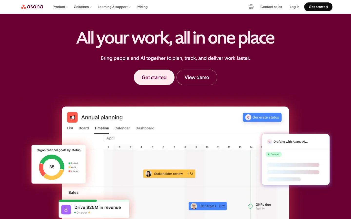
In KlientBoost's roundup of SaaS landing pages, examples like Asana show a pattern that appears again and again in high-performing SaaS: the product promise is visible quickly, the interface is easy to imagine using, and the CTA does not require much interpretation.
What is worth borrowing is not the styling. It is the compression.
Asana's kind of homepage pattern tends to do three things well:
It communicates category fast.
It makes collaboration or workflow value tangible.
It gives the visitor an easy next step.
If your site needs three paragraphs to explain what your product does, you are already behind.
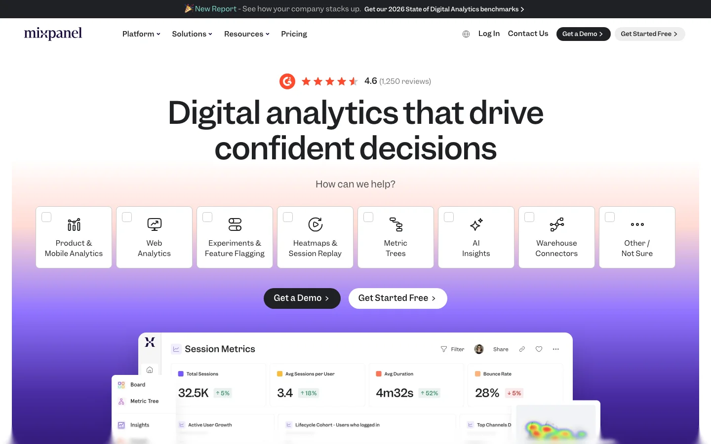
The same KlientBoost analysis points to examples like Mixpanel for another lesson: product-led SaaS sites often win when the interface itself acts as proof.
That matters for analytics, automation, and infrastructure products that can feel abstract in copy alone.
A screenshot is not enough by itself, but a well-chosen interface visual can answer two key questions quickly:
Is this product real?
Can I see myself using it?
That is why vague illustration-heavy sites often underperform in B2B SaaS. They may look modern, but they hide the actual product.
There is also a broader pattern worth noting. The SaaS Landing Page gallery curates more than 910 examples, and the recurring visual direction is not loud creativity. It is clean, app-inspired interfaces, restrained color systems, and layouts that make product understanding easy.
That does not mean every page should look the same. It means buyers have learned to associate certain UI behaviors with competence and software maturity.
Webflow's 2025 roundup of SaaS website examples reinforces a similar pattern: the strongest sites feel modern, but they also reduce cognitive load. The page does not make you decode what matters.
A redesign without measurement is mostly theater.
If I were rebuilding a high-conversion SaaS website from scratch, I would not launch without these basics:
Baseline homepage conversion rate to trial or demo
CTA click tracking by page section
Scroll depth and engagement events
Funnel segmentation by channel
Form completion rate and drop-off field analysis
Heatmap or session review for key landing pages
Tools vary. Google Analytics, Mixpanel, and Amplitude can all support pieces of this depending on your motion.
What matters is discipline. Define the baseline, define the target, define the timeframe, and isolate what changed.
If hard conversion data is thin, use a practical measurement plan instead of pretending certainty:
Baseline metric: current visit-to-trial or visit-to-demo rate
Target metric: percentage improvement by page type
Timeframe: first 4 to 6 weeks after launch
Instrumentation: analytics events, form tracking, and session reviews
That approach is far more useful than saying a redesign "felt better." If the page got prettier but demo quality dropped, the redesign failed.
For teams buying traffic, our guide on whether your website is ready for ads goes deeper on this handoff between conversion design and paid performance.
Founders rarely get the luxury of a perfect rewrite. Usually the real question is what to fix first without slowing go-to-market.
This is the sequencing I would use.
Rewrite the hero and subhead until a qualified buyer can understand the offer in one pass. If internal stakeholders all describe the product differently, stop there and fix that first.
Do not send every visitor to the homepage.
Branded search might belong there. Paid search often does better on use-case or pain-point pages. Partner traffic may need integration pages. Mid-funnel retargeting often needs stronger proof assets.
Put testimonials, trust badges, customer logos, or case-study links next to the claims that need belief. If you have no case studies yet, use product proof, setup clarity, or implementation detail instead of generic praise.
At minimum, create:
One persona page
One use-case page
One integration page
That simple expansion often reveals where messaging is too broad.
If the page offers both "Book a demo," "Start free," "Talk to sales," and "Get started" without clear hierarchy, you are making the visitor choose your funnel for you.
Pick the primary motion for that page and support it with one dominant CTA.
Set up events, form tracking, and benchmarks before changes go live. Otherwise you end up comparing memories instead of data.
This sounds soft, but it is usually where teams miss obvious issues. Read the page cold. Ask what feels vague, unbelievable, or incomplete. Then ask sales what prospects keep questioning on calls.
That is often where the next conversion lift is hiding.
Some conversion losses come from big strategic misses. Others come from dozens of small decisions that add friction.
The most common ones:
If the homepage tries to serve startups, enterprise buyers, agencies, and technical evaluators at the same time, nobody gets a clear path.
Animation, layered visuals, and abstract copy can make a site feel polished while reducing understanding. This is the exact tradeoff behind the clarity-over-aesthetics argument from Stan Vision.
Features do not convert on their own. Buyers need to understand what changes, what gets easier, what risk drops, or what result improves.
A quote saying "great platform" does little. A quote tied to a real use case or implementation win does much more.
This is a costly split. Comparison pages, integration pages, and use-case pages often pull in high-intent traffic. They should not read like search bait.
If you want AI systems and humans to cite your brand, those pages need a clear point of view and a clean answer, not filler.
That is also why our conversion-focused website guide and our UX optimization article both come back to the same principle: design has to serve revenue, not decorate it.
More than one, but fewer than most teams think. Start with a strong homepage, then add the highest-leverage supporting pages: at least one persona page, one use-case page, and one integration page.
That depends on the sales motion and product complexity. If your product requires education, setup, or stakeholder buy-in, demos may outperform. If time-to-value is fast and the product is intuitive, a free-trial path can work better.
As long as needed to resolve the buyer's uncertainty, and no longer. Simple self-serve products can convert with shorter pages. Complex B2B products often need more proof, workflow explanation, and objection handling.
Page-by-page is often safer when positioning is still evolving. Full redesigns make sense when the brand, product story, and conversion path are all misaligned. If speed matters, start with the highest-traffic or highest-spend pages first.
Track visit-to-trial or visit-to-demo rate, CTA clicks, form completion, bounce by channel, and page-specific conversion by segment. Review both volume and quality so you do not accidentally increase low-intent conversions.
A high-conversion SaaS website is not built by collecting design inspiration and hoping the pieces fit. It is built by making the buyer's next decision easier at every scroll.
Want help applying this to your business?
Raze works with SaaS teams to turn positioning, page design, and conversion strategy into measurable growth. Book a demo with the team.
Lav Abazi
9 articles
Business, strategy, growth, positioning, marketing leadership, pricing, sales, and operational topics

Mërgim Fera
10 articles
Design, branding, UI/UX, creative direction, visual systems, website and product design topics

Ed Abazi
4 articles
Ed Abazi is crazy good at what he does
Learn how SaaS marketing site architecture affects conversion, trust, and pipeline, plus a practical blueprint for building a site that sells.
Read More
A breakdown of the 7 patterns behind high-converting landing pages for SaaS, from message match to testing loops and conversion-focused design.
Read More