Mërgim Fera
151 articles
Co-founder at Raze, writing about branding, design, and digital experiences.
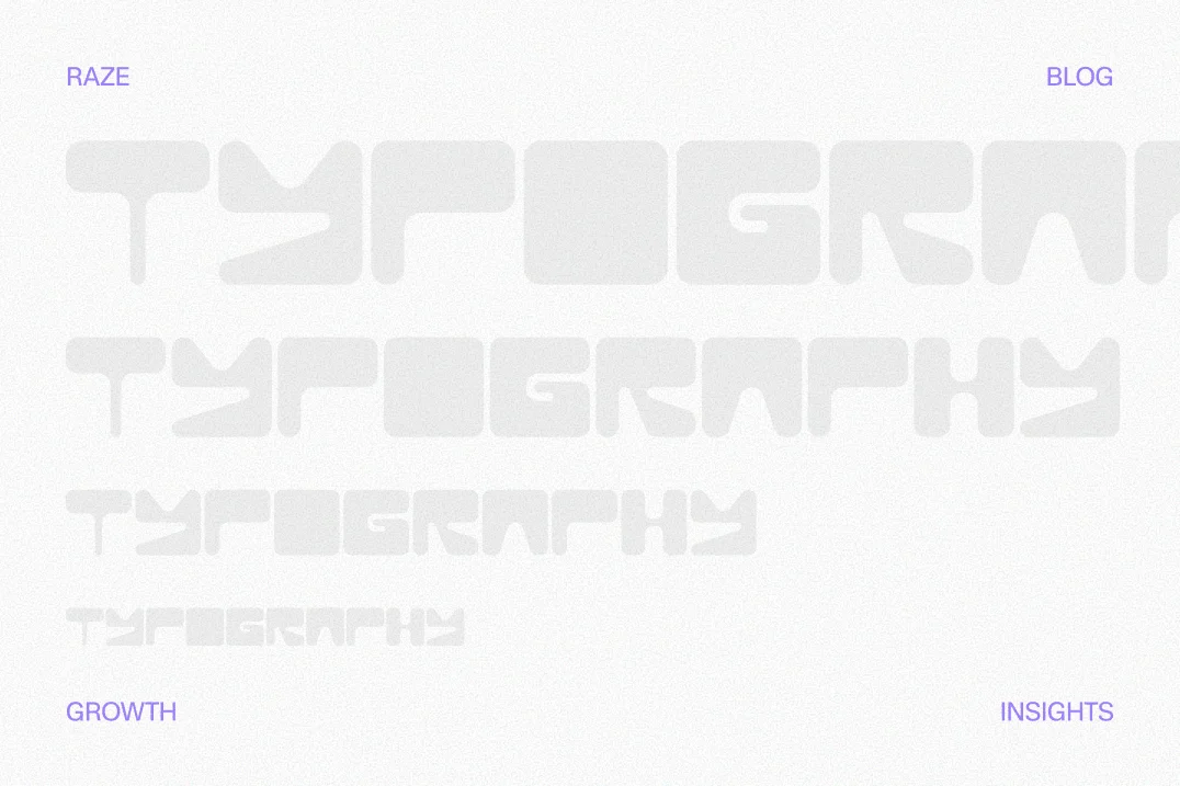
SaaS typography influences how stable and trustworthy a platform feels. Learn how font weight and hierarchy shape perception and conversions.
Written by Mërgim Fera
TL;DR
SaaS typography influences how trustworthy and stable a product feels. Clear font hierarchy and thoughtful weight distribution reduce cognitive load, helping users scan information and understand value faster.
Typography decisions quietly shape how users judge the credibility of a SaaS platform. Font weight, spacing, and hierarchy influence whether software feels stable, professional, and worth adopting.
In SaaS marketing and product interfaces, typography acts as a signal of reliability. When hierarchy is clear and visual weight is consistent, users process information faster and perceive the product as more trustworthy. Poor typography, by contrast, creates cognitive friction that often translates into hesitation or lower conversion rates.
A useful shorthand: clear typographic hierarchy reduces cognitive load, and reduced cognitive load increases perceived trust in software interfaces.
Users rarely evaluate typography consciously. Instead, they interpret subtle visual cues as signals of product quality.
Research from the Nielsen Norman Group consistently shows that visual clarity strongly influences perceived usability. When users can scan information easily, they assume the product itself is well engineered.
Typography directly affects that clarity.
In SaaS environments, typography performs several trust-related roles:
It organizes complex information
It signals product maturity
It communicates brand professionalism
It reduces effort required to understand value
For early-stage SaaS companies, these signals matter more than many founders expect. A visitor evaluating a product often spends only seconds deciding whether the platform feels credible.
A landing page that visually resembles mature SaaS products such as Stripe or Notion communicates stability before a user reads a single sentence.
Typography contributes heavily to that impression.
Human visual processing prioritizes contrast and structure before reading actual words.
Eye‑tracking research published by the Interaction Design Foundation shows that users scan digital interfaces in patterns that prioritize headings, bold text, and visual groupings.
Font weight and hierarchy help guide that scan.
When hierarchy is inconsistent, the brain struggles to determine what matters most. That uncertainty increases cognitive load, which often translates into skepticism toward the product.
For SaaS platforms, this matters across multiple surfaces:
Marketing landing pages
Pricing pages
Dashboard interfaces
Product onboarding
Documentation
Each environment depends on typography to help users interpret information quickly.
Many startups focus heavily on branding aesthetics while underestimating the structural role of typography.
Designers sometimes choose fonts based on style rather than readability hierarchy. Founders may also compress spacing to "fit more information," which weakens hierarchy and makes interfaces feel unstable.
This problem appears frequently in SaaS marketing sites where messaging competes visually rather than guiding the reader.
The result is not simply a design flaw. It is a trust problem.
Clear typography tells users that the product team understands usability. Confusing typography suggests the opposite.
A practical way to approach SaaS typography is to treat it as a hierarchy system rather than a set of aesthetic choices.
One useful framework is the Trust Typography Hierarchy Model, a four-layer structure used by many mature SaaS interfaces.
Primary message layer – The most important statement on the page. Usually large, high‑contrast headings.
Structural navigation layer – Section headers and navigation cues that guide scanning.
Information layer – Body text, product descriptions, and supporting details.
Evidence layer – Labels, annotations, metrics, and microcopy that reinforce credibility.
When these layers remain visually distinct, users understand information faster and perceive the platform as more organized.
When the layers blur together, pages feel chaotic.
The first layer communicates the product's core promise.
This typically appears in hero headlines, value propositions, and critical feature statements.
High‑performing SaaS sites frequently use:
Large font sizes
Medium or bold weights
Strong contrast with background
Platforms such as Intercom and Linear rely heavily on strong headline hierarchy to anchor messaging.
If the primary message lacks weight or contrast, users may miss it entirely during the first page scan.
The second layer helps users navigate the page.
These elements include:
Section headings
Feature titles
Pricing plan labels
They should be visually distinct from both headlines and body text.
Common implementation patterns include:
Semi‑bold weights
Slightly smaller font sizes than headlines
Increased spacing above sections
Without this structure, landing pages become visually flat.
Flat pages increase reading effort, which often correlates with higher bounce rates.
For SaaS teams optimizing conversion pages, hierarchy becomes particularly important. Many of the structural patterns discussed here appear consistently in high‑performing pages analyzed in this landing page research.
The majority of SaaS content sits in the body text layer.
Body typography must prioritize readability above brand style.
Common characteristics include:
Regular font weights
Moderate line length
Comfortable line height
Guidelines published by Google Material Design recommend line lengths between roughly 45 and 75 characters for digital reading.
When lines stretch significantly beyond this range, comprehension decreases.
In SaaS marketing pages, overly dense body text can make products appear complicated even when they are not.
Typography indirectly communicates simplicity.
The final layer reinforces credibility.
Evidence elements include:
Customer quotes
Metrics
Product annotations
UI labels
These components often use lighter weights, smaller sizes, or subtle contrast.
They should not compete visually with the main message. Instead, they support it.
Well‑designed evidence typography allows users to validate claims without distracting from the primary narrative.
Font weight is one of the most overlooked variables in SaaS typography.
Weight affects visual confidence.
Heavier typography often communicates authority and clarity, while extremely thin fonts can feel fragile or experimental.
Many SaaS companies once adopted ultra‑light typography because it looked modern. Over time, product teams discovered that thin fonts frequently reduce readability across devices.
This is particularly true on lower‑resolution screens.
Over the past decade, many technology companies have shifted toward practical typography systems.
Examples include:
These fonts prioritize legibility across different screen sizes.
They also offer multiple weight options that allow designers to build clear hierarchy systems.
For SaaS teams, flexibility matters more than stylistic uniqueness.
The goal is consistent hierarchy, not decorative typography.
Heavier font weights often perform better in specific interface areas:
Dashboard navigation
Product feature labels
Pricing plan names
Key metrics
These areas benefit from strong visual anchors.
If labels feel visually weak, the interface can appear unfinished.
That perception affects user confidence in the product itself.
Not every element should be bold.
Subtle typography helps establish hierarchy by creating contrast.
Lighter weights work well for:
Secondary descriptions
UI hints
Interface metadata
Balance is essential. If everything is bold, nothing stands out.
Typography affects marketing performance as much as interface usability.
Landing pages depend on scan‑friendly structures. When visitors can quickly identify the value proposition, they are more likely to continue reading.
Clear typographic hierarchy improves several conversion factors:
Message clarity
Reading speed
Feature comprehension
CTA visibility
Platforms such as HubSpot and Figma consistently use typography systems that guide users through marketing pages in logical steps.
Many teams assume that adding multiple font styles improves visual interest.
In SaaS marketing, the opposite is usually true.
Using more than two typefaces often weakens hierarchy and creates visual noise.
A simpler system usually performs better.
A practical rule observed across high‑performing SaaS websites:
One primary font family
One optional accent font
Multiple weight levels within the primary family
This approach maintains visual consistency while still providing hierarchy.
Typography improvements should be validated through measurement rather than taste.
A practical evaluation process includes:
Baseline measurement – Record current metrics such as landing page conversion rate, scroll depth, and reading engagement in Google Analytics or Amplitude.
Typography intervention – Adjust hierarchy, font weight distribution, and spacing.
Behavior tracking – Monitor changes in engagement metrics using tools such as Hotjar or Microsoft Clarity.
Evaluation window – Measure performance over several weeks to account for traffic variation.
Teams often observe improvements in scan depth and interaction when hierarchy becomes clearer, though results vary depending on traffic sources and messaging quality.
Typography improvements rarely require a full redesign. Small structural changes can significantly improve clarity.
Founders and product teams can evaluate their typography system using the following checklist.
Confirm a single primary font family
Multiple typefaces often introduce inconsistency. Most SaaS products benefit from one flexible font family with several weights.
Audit heading contrast
Primary headlines should be visually dominant. If they blend into surrounding content, the hierarchy is too weak.
Limit weight variations
Using too many weight levels can confuse the hierarchy. Three or four levels usually work well.
Check line length and spacing
Body text should remain readable across desktop and mobile devices. Excessively long lines reduce comprehension.
Test typography inside product interfaces
Marketing pages often receive attention, while dashboard typography remains inconsistent.
Evaluate mobile readability
Thin fonts frequently fail on smaller screens. Mobile previews should be part of the design process.
Validate hierarchy through user testing
Ask users to scan a page for five seconds and describe the main message. If they struggle, the typography hierarchy needs adjustment.
These checks help ensure typography supports growth goals rather than simply fulfilling aesthetic preferences.
Several typography patterns repeatedly appear on underperforming SaaS sites.
Extremely light headline weights may look elegant in static mockups but often reduce readability in real environments.
Users scanning quickly may miss the main value proposition.
Uppercase typography removes natural word shapes that assist reading.
Short labels can work in uppercase, but long headlines become harder to scan.
Guidelines from the U.S. Web Design System advise limiting uppercase usage primarily to short labels or navigation.
When feature descriptions lack spacing and hierarchy, users struggle to distinguish key points.
Spacing is a typographic tool as important as font choice.
Display fonts may work for branding assets but rarely perform well inside dashboards.
Interfaces require functional typography.
Typography also affects accessibility compliance.
The Web Content Accessibility Guidelines recommend sufficient contrast ratios and readable text sizes.
Ignoring these guidelines can reduce usability for a significant portion of users.
Accessibility improvements often produce secondary benefits for all users.
Typography is closely tied to product perception.
Products targeting enterprise buyers often use stronger hierarchy and slightly heavier typography to communicate stability.
Developer‑focused tools frequently use monospace elements to signal technical precision.
Design choices reflect positioning.
A useful example appears in UX research around empathy and usability. When typography reflects the user's reading patterns and cognitive expectations, interfaces feel intuitive rather than demanding. This perspective aligns with the principles explored in this discussion of empathy in UX design.
Typography becomes a communication layer between the product team and the user.
The typography strategy should adapt to context.
Marketing pages typically prioritize persuasion and narrative flow.
Product dashboards prioritize scannability and information density.
However, the underlying hierarchy system should remain consistent across both environments.
Consistency reinforces brand recognition and reduces learning friction.
When marketing and product typography diverge dramatically, users may feel they are interacting with two different companies.
Typography influences how quickly users understand messaging. Clear hierarchy reduces cognitive load and helps visitors scan key information such as product benefits, features, and pricing.
Most SaaS products perform best with one primary font family and several weight variations. Adding multiple fonts often weakens hierarchy and creates visual inconsistency.
Typography influences clarity and reading behavior, which indirectly affects conversions. When users can scan information quickly, they are more likely to understand the value proposition and continue through the funnel.
Many design systems recommend body text between roughly 16px and 18px for desktop reading. The ideal size depends on line length, font choice, and device context.
System fonts often improve performance and readability. Many SaaS platforms prefer widely supported fonts such as Inter or Roboto because they render consistently across devices.
Landing pages benefit from stronger visual hierarchy and larger headlines. Dashboards typically use smaller but highly structured typography to support scanning large amounts of information.
Typography rarely receives the same strategic attention as messaging or pricing, yet it shapes how users interpret both.
In SaaS environments, typography is not decoration. It is infrastructure for communication.
Clear hierarchy reduces cognitive effort, improves scanning behavior, and signals product maturity. Those signals directly influence trust, which ultimately affects adoption and conversion.
Founders evaluating growth bottlenecks should treat typography as a structural component of their marketing and product experience.
Want help applying these principles to your product and marketing site?
Raze works with SaaS teams to design high‑converting websites, landing pages, and product experiences that turn clarity into measurable growth.
Book a demo: schedule a strategy session with the Raze team.
Mërgim Fera
151 articles
Co-founder at Raze, writing about branding, design, and digital experiences.
A breakdown of the 7 patterns behind high-converting landing pages for SaaS, from message match to testing loops and conversion-focused design.
Read More
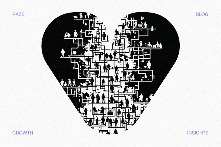
Empathy heart UX design helps SaaS teams move beyond templates by understanding user motivations and friction points to build trust and increase conversions.
Read More