
Mërgim Fera
147 articles
Co-founder at Raze, writing about branding, design, and digital experiences.
SaaS motion design helps startups signal technical maturity, improve UX clarity, and increase conversions through subtle, purposeful animations.
Written by Mërgim Fera
TL;DR
SaaS motion design helps startups signal technical maturity by demonstrating product behavior through subtle animations and interactive elements. When used strategically, motion improves product clarity, engagement, and perceived credibility without slowing site performance.
A surprising number of SaaS websites still feel frozen in time. Static hero sections, rigid UI blocks, and zero interaction signals often make even strong products appear less sophisticated than they are.
Founders rarely notice this gap until prospects start comparing their product to competitors whose sites feel faster, more interactive, and more technically mature. The difference is often not better features. It is motion.
A simple truth worth remembering: well‑designed motion is one of the fastest ways for a SaaS product to signal technical credibility.
When potential customers land on a SaaS homepage, they begin forming trust judgments within seconds. Research from the Stanford Web Credibility Project has long shown that visual design is one of the strongest signals users rely on when evaluating digital products.
But credibility in SaaS is not only about typography or color palettes. Increasingly, it is about behavior.
Modern interfaces move. They respond. They reveal information gradually.
When nothing moves, the experience often feels outdated.
Consider two scenarios:
• A dashboard screenshot displayed as a static image • A short animated interaction showing filters updating in real time
Both communicate the same feature. But the animated version demonstrates capability instead of describing it.
This difference matters for early-stage SaaS companies. Buyers often cannot fully evaluate the product without signing up. The marketing site becomes the first proof of technical maturity.
Motion fills that gap.
It communicates that the team understands modern product design, interaction patterns, and performance expectations.
Teams exploring this concept often discover that motion is not decoration. It is part of conversion design. In fact, many high-performing marketing sites share similar behavioral patterns, something explored in detail in this landing page analysis.
A common mistake is treating SaaS motion design as visual flair.
Founders often think of motion as flashy transitions, looping illustrations, or elaborate hero animations. Those elements can easily become distractions.
Effective SaaS motion design behaves differently. It communicates system behavior.
Google’s Material Design guidelines describe motion as a tool that helps users “understand spatial relationships, hierarchy, and feedback.” The documentation explains how movement can reinforce meaning inside interfaces: https://m3.material.io/design/motion
In practice, the most valuable motion patterns usually fall into three categories.
Small responses when users hover, click, or submit forms.
Examples include:
• Button state changes • Input validation animations • Loading indicators
These signals tell users the system is responding. Without them, interfaces feel unreliable.
Changes between interface states.
Examples:
• Expanding navigation panels • Switching dashboard tabs • Filtering data views
Well‑designed transitions make complex products easier to understand.
Used primarily on marketing sites.
Examples include:
• Animated product walkthroughs • Scroll‑triggered interface reveals • Feature demonstrations
These animations compress product understanding into seconds.
When executed well, they reduce cognitive load instead of increasing it.
After redesigning several SaaS marketing sites over the past few years, a repeatable pattern emerges. Motion works best when introduced gradually through a sequence that reinforces product capability.
This can be thought of as the Motion Credibility Loop.
Begin with micro‑interactions across navigation and UI components. Hover states, responsive buttons, and input feedback create immediate trust that the product behaves predictably.
Next, introduce small product simulations inside the marketing site. Short UI animations show how dashboards update, how filters behave, or how workflows progress.
Complex features become easier to grasp when transitions visually explain cause and effect.
Visitors begin associating the product with modern engineering standards.
The result is subtle but powerful. Motion moves the conversation from “What does this product do?” to “This feels like a sophisticated product.”
Most teams initially treat motion as a branding exercise. In reality, its most measurable effects appear in conversion performance.
Several key areas tend to benefit the most.
A static hero screenshot rarely explains workflow.
Animated product previews solve this problem by demonstrating interaction within seconds.
Companies like Figma and Notion frequently use short looping UI sequences to show how actions trigger results inside their platforms.
Instead of reading three paragraphs, visitors watch the product behave.
Platforms with multi‑step workflows benefit heavily from motion.
Tools such as Intercom and HubSpot often animate workflows to show how automation sequences unfold.
A diagram explains structure.
Motion explains behavior.
Scroll‑triggered animations encourage exploration when implemented carefully.
Libraries like GSAP or Framer Motion allow designers to introduce subtle transitions that guide attention without harming performance.
Products with technical complexity often appear more credible when motion demonstrates depth.
For example, data dashboards can animate chart updates or query results.
The movement suggests real data processing rather than static imagery.
Poorly implemented animation can easily damage performance. Many founders fear motion for exactly this reason.
But modern tools make lightweight motion practical if implemented thoughtfully.
When introducing SaaS motion design to a marketing site, teams often follow a simple evaluation checklist.
Look for places where users hesitate. Forms, navigation changes, and product explanations are common examples.
Motion should clarify those moments.
Short interface animations demonstrate cause and effect better than screenshots.
These can often be exported from product prototypes using tools like Figma or Lottie.
Small feedback loops often create the largest perception improvements with minimal performance cost.
Tools such as Google Analytics or Amplitude can track scroll depth, interaction events, and section engagement after motion updates.
Use GPU‑friendly properties like transforms and opacity. Avoid layout‑heavy animations that cause reflows.
Following these principles allows motion to enhance conversion without slowing the experience.
Motion can strengthen credibility. But when used incorrectly, it has the opposite effect.
Several patterns appear frequently.
Many startup sites open with elaborate looping graphics unrelated to the product.
These animations consume bandwidth but explain nothing.
Product motion should demonstrate capability, not decorate space.
Parallax layers, complex transitions, and cinematic scroll effects often feel impressive during design reviews.
Users experiencing them repeatedly often find them distracting.
Subtle motion usually performs better than dramatic sequences.
Operating systems allow users to reduce motion for accessibility reasons. Apple documents these guidelines within its Human Interface documentation: https://developer.apple.com/design/human-interface-guidelines/motion
Sites should respect these settings and disable non‑essential animations when requested.
Motion should clarify information hierarchy.
If animations delay content or hide key information, they harm comprehension.
The goal is faster understanding, not visual spectacle.
Teams often assume motion requires large engineering investment. In reality, modern web tooling has made interactive experiences significantly easier to implement.
Several tools dominate SaaS marketing stacks.
A React animation library commonly used for interface transitions and micro‑interactions.
Official documentation: https://www.framer.com/motion/
A powerful animation engine used for high‑performance motion on complex interfaces.
Official site: https://gsap.com
A lightweight format that renders After Effects animations as JSON files.
Developers can integrate animations using minimal performance overhead.
Documentation: https://lottiefiles.com
Visual site builders like Webflow and Framer increasingly allow founders to implement sophisticated motion without heavy development work.
For many early‑stage SaaS teams, these tools make motion experimentation significantly faster.
There is a growing belief that modern SaaS sites must feel “alive” everywhere.
That assumption is often wrong.
High‑intent pages sometimes perform better when they remain simple.
Pricing pages, documentation pages, and signup flows benefit from clarity more than theatrics.
Motion is most powerful when used selectively:
• Hero product demonstrations • Feature walkthrough sections • Interface transitions
Restraint creates contrast. When motion appears only where it adds meaning, it becomes more persuasive.
SaaS motion design refers to the use of animations, transitions, and interactive behaviors within SaaS websites and product interfaces to communicate functionality, improve usability, and strengthen perceived technical credibility.
Motion itself does not guarantee conversion improvements. However, when used to clarify product behavior, demonstrate workflows, or improve interaction feedback, it often reduces confusion and increases engagement.
They can if implemented poorly. Lightweight techniques such as GPU‑accelerated transforms, optimized Lottie files, and efficient libraries like GSAP allow modern motion design with minimal performance impact.
Micro‑interactions, product walkthrough animations, and state transitions tend to provide the most value. These patterns improve usability while demonstrating how the product behaves.
Teams can run A/B experiments using tools like Optimizely or analyze engagement events through analytics platforms such as Amplitude. Measuring scroll engagement, time on section, and demo request rates helps validate the impact.
Motion is not about spectacle. It is about signaling capability.
When SaaS products look static, they often appear less advanced than they truly are. Subtle movement closes that perception gap and communicates how the product actually behaves.
Want help applying this to your business?
Raze works with SaaS teams to design marketing sites that demonstrate product capability and convert traffic into pipeline.
Book a demo: schedule a growth consultation
Mërgim Fera
147 articles
Co-founder at Raze, writing about branding, design, and digital experiences.
A breakdown of the 7 patterns behind high-converting landing pages for SaaS, from message match to testing loops and conversion-focused design.
Read More
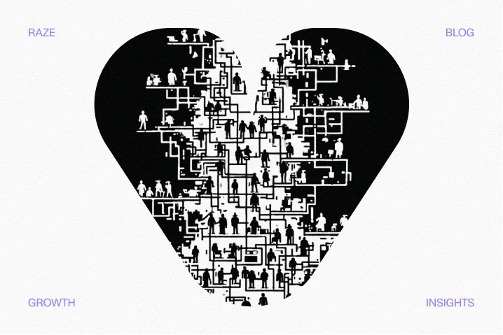
Empathy heart UX design helps SaaS teams move beyond templates by understanding user motivations and friction points to build trust and increase conversions.
Read More