
Ed Abazi
115 articles
Co-founder at Raze, writing about development, SEO, AI search, and growth systems.
SaaS comparison templates help companies capture high‑intent search traffic from buyers evaluating competitors. Learn how to build scalable, conversion‑focused comparison pages.
Written by Ed Abazi
TL;DR
SaaS comparison templates help companies scale high‑intent SEO pages targeting "X vs Y" searches. Structured comparison pages capture evaluation‑stage traffic and can create a durable acquisition moat against competitors.
Buyers rarely start with a blank search query. Most SaaS purchasing journeys begin with comparison searches that include a specific competitor name.
For early‑stage companies, this creates a powerful opportunity. Structured SaaS comparison templates allow teams to publish dozens of high‑intent pages quickly, turning competitor searches into a durable SEO moat.
A simple reality drives the strategy: the buyer searching “YourProduct vs Competitor” is already in evaluation mode. Capturing that moment changes the economics of acquisition.
Search behavior during the evaluation phase looks very different from early research queries. Prospects move from general questions to specific vendor comparisons.
Queries such as:
signal that the buyer is already narrowing their shortlist.
According to research highlighted by Powered by Search’s analysis of SaaS comparison landing pages, comparison pages are one of the most effective ways for B2B SaaS companies to capture evaluation‑stage traffic. Users searching competitor comparisons are typically deciding between a small number of options.
That creates a strategic opening. If a company publishes a clear, transparent comparison page, it can intercept demand that would otherwise go directly to the competitor.
The compounding effect becomes obvious once companies scale these pages. Instead of targeting a single keyword, a SaaS product can create dozens of pages addressing different competitor searches.
This is where SaaS comparison templates become critical.
SaaS comparison templates allow companies to systematically publish “us vs them” pages that capture high‑intent evaluation traffic at scale.
Many companies attempt comparison content as a one‑off effort. A marketing team publishes a single “Product vs Competitor” article and moves on.
This approach rarely scales.
The real advantage emerges when comparison pages are built from a repeatable template. Instead of designing each page individually, teams create a consistent structure that can be reused across dozens of competitors.
The benefit is twofold.
First, production speed increases dramatically. Writers, designers, and marketers can produce pages quickly because the format already exists.
Second, SEO performance becomes more consistent. Search engines tend to favor structured pages that clearly answer evaluation questions.
Research on scalable content production notes that templates optimized for industry terminology and audience expectations make it easier to produce large volumes of relevant pages. This pattern is highlighted in guidance from Byword’s SaaS comparison template framework, which emphasizes structured language and consistent feature comparisons.
From a growth perspective, templates transform comparison content from a blog tactic into a defensible acquisition channel.
Across successful SaaS comparison pages, a recognizable structure appears repeatedly. Companies such as Ramp, Typeform, and Qonto use similar layouts to guide buyers through a decision process, as documented in collections of modern comparison pages like Nikolai Bain’s SaaS comparison examples.
The structure functions less like a blog post and more like a product evaluation document.
A practical model for SaaS comparison templates typically includes four components.
The page opens with a short explanation of who each product is designed for. This helps buyers quickly determine whether the comparison is relevant.
Example:
“Product A focuses on enterprise support automation, while Product B prioritizes lightweight messaging for startups.”
This framing prevents the comparison from feeling adversarial. Instead, it clarifies use cases.
Structured feature comparisons are often the centerpiece of the page.
These tables allow readers to scan differences quickly. Feature matrices commonly include:
The key is clarity. Avoid marketing language and simply document the capabilities of each product.
Feature lists alone rarely persuade buyers. What often matters more is workflow design.
For example:
Explaining these operational differences helps buyers visualize how each tool fits their team.
The strongest comparison pages close with clear recommendations.
Instead of declaring a universal winner, they outline scenarios:
This approach maintains credibility while helping buyers move toward a decision.
Design matters significantly in comparison pages because readers are evaluating complex information quickly.
Modern SaaS comparison layouts rely heavily on visual structures instead of long paragraphs.
For example, visual comparison methods such as bubble charts and feature maps help communicate product differences more effectively than text alone. Documentation for the Miro SaaS plan comparison bubble chart template highlights how visualizing price tiers and feature depth can make complex tradeoffs easier to understand.
These visual elements appear frequently in successful comparison pages:
Design libraries such as the curated gallery on SaaSFrame’s comparison page collection show how leading SaaS companies combine these elements into clean evaluation pages.
The design principle is simple: comparison pages should reduce cognitive load.
Buyers should be able to scan the page and immediately understand the differences.
For teams building product‑led SEO programs, comparison templates should be designed for scale from the beginning.
The following rollout process helps avoid the most common bottlenecks.
Start by identifying which competitors generate meaningful search volume.
Sources include:
This step ensures the template program focuses on real evaluation demand.
Define consistent sections across all pages:
Consistency improves SEO signals and speeds up production.
The page design should support repeatable blocks such as:
This modular approach allows new competitor pages to launch quickly.
Credibility determines whether comparison pages convert.
Evidence may include:
Avoid unsupported claims about competitors.
Comparison pages often influence deals rather than closing them immediately.
Teams should track:
Tools such as Google Analytics or product analytics platforms like Mixpanel can attribute conversion influence across the funnel.
Many companies approach comparison pages like competitive takedowns.
This usually backfires.
Buyers evaluating software are highly skeptical of marketing claims. Overly aggressive comparisons can undermine credibility.
The more effective approach is neutral analysis.
Instead of declaring superiority, high‑performing comparison pages typically:
This approach mirrors the structure used by many of the modern comparison examples documented in Navattic’s analysis of SaaS comparison pages, which emphasizes transparency and product fit rather than adversarial positioning.
The paradox is that neutrality often strengthens persuasion.
When buyers trust the comparison, they are more likely to continue evaluating the product.
Consider a SaaS company competing in a category with 25 relevant vendors.
Without templates, producing comparison content might require several weeks per page. Most teams would publish only a handful of comparisons.
With structured SaaS comparison templates, the same company can systematically launch pages such as:
Each page captures search traffic from buyers already researching those competitors.
Over time, the effect compounds.
Instead of competing only on broad category keywords, the company captures demand across dozens of evaluation queries.
The strategy becomes even more powerful when comparison pages integrate with broader conversion‑focused website design. Strong comparison content often directs readers toward product pages, demo requests, or onboarding flows.
Companies that treat comparison content as part of their growth architecture often see measurable improvements in conversion behavior. Design clarity plays a significant role here, which is why UX principles such as those discussed in this exploration of empathy in product design often apply equally to marketing pages. When a page answers the buyer’s real evaluation questions, trust increases.
Even well‑intentioned comparison strategies can fail if the pages feel biased or incomplete.
Several patterns frequently undermine performance.
Feature lists alone rarely help buyers decide.
The more useful comparison explains how features change workflows or outcomes.
Buyers often search comparisons specifically to understand cost differences.
When pricing information is publicly available, hiding it reduces credibility.
Long narrative articles tend to perform poorly compared to structured evaluation pages.
Buyers scanning comparisons prefer tables, summaries, and visual elements.
Publishing a single comparison rarely moves the needle.
The real value emerges when companies build entire clusters of comparison pages targeting multiple competitors.
Comparison pages should influence purchase decisions, not just rankings.
The strongest pages guide readers toward product evaluation or a demo request.
SaaS comparison templates are structured page layouts used to compare one product against competitors. They typically include feature tables, pricing comparisons, workflow explanations, and guidance on which product fits different use cases.
Comparison searches reflect evaluation‑stage intent. Users searching queries such as “Product A vs Product B” are actively deciding between options, which makes these pages highly relevant to search engines.
The number depends on the competitive landscape. Most categories include 10 to 30 meaningful competitors, which creates an opportunity for an entire library of comparison pages.
Yes. Acknowledging competitor advantages increases credibility and makes the page feel objective. Balanced comparisons are more persuasive to buyers evaluating multiple options.
The most effective pages prioritize clarity over length. Instead of long paragraphs, they use structured sections, comparison tables, and concise explanations.
Comparison pages often start as an SEO experiment but eventually become a strategic asset.
Each page targets a specific evaluation query. As more pages launch, the company gradually captures a larger share of competitor search traffic.
The result is what many growth teams describe as a comparison moat.
Competitors can replicate individual pages, but replicating an entire library of well‑designed comparison content takes significant effort.
For SaaS companies competing against larger incumbents, this strategy offers a rare advantage. Instead of outspending competitors on ads, they intercept buyers at the moment of evaluation.
When executed well, SaaS comparison templates turn competitor searches into one of the most efficient acquisition channels in the entire growth stack.
Want help applying this to your business?
Raze works with SaaS and tech teams to turn strategy into measurable growth.
Book a demo: speak with the Raze team about scaling your SaaS growth strategy
Ed Abazi
115 articles
Co-founder at Raze, writing about development, SEO, AI search, and growth systems.
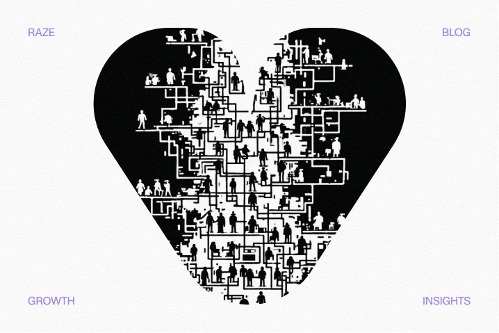
Empathy heart UX design helps SaaS teams move beyond templates by understanding user motivations and friction points to build trust and increase conversions.
Read More
A breakdown of the 7 patterns behind high-converting landing pages for SaaS, from message match to testing loops and conversion-focused design.
Read More