
Mërgim Fera
147 articles
Co-founder at Raze, writing about branding, design, and digital experiences.
High-fidelity design for startups helps founders reduce investor skepticism and demonstrate product readiness before a funding round.
Written by Mërgim Fera
TL;DR
High-fidelity design for startups helps technical founders demonstrate product readiness and reduce investor skepticism. A polished prototype allows investors to evaluate the product experience directly rather than imagine it.
Technical founders often approach fundraising with a product that works but does not yet look finished. Investors, however, rarely evaluate products in purely technical terms. Visual authority, interaction clarity, and product presentation shape how quickly investors believe the company is ready to scale.
High-fidelity design for startups bridges that gap. A polished prototype or product interface signals maturity, reduces ambiguity during demos, and allows the product to speak for itself.
A simple rule captures the dynamic: investors judge readiness in seconds, and design is the fastest signal of readiness.
Fundraising conversations often compress months of product work into a short meeting or demo. Investors must quickly decide whether a company is still exploring an idea or preparing to scale a product.
Design becomes a proxy signal.
When a product appears unfinished, investors assume the underlying company is also unfinished. When the interface feels coherent, deliberate, and production-ready, the product appears closer to market maturity.
This reaction is not simply aesthetic preference. High-fidelity prototypes replicate the experience of the final product. According to the documentation from Figma’s resource library on high-fidelity prototyping, a high-fidelity prototype is a polished simulation of the final product that includes real content and detailed visual design.
That simulation allows investors to evaluate the product experience rather than imagine it.
Research from the usability firm Nielsen Norman Group also notes that high-fidelity prototypes reduce the need to verbally explain what happens next during a demo. Observers can focus on the product itself rather than interpreting abstract descriptions.
For technical founders, this difference is significant. A strong demo moves the conversation away from explaining mechanics and toward discussing growth potential, distribution, and market expansion.
Many early-stage companies reach fundraising milestones with functional products that evolved quickly. Engineering speed tends to prioritize working features over visual refinement.
The result is a common pattern.
The product works. The infrastructure scales. The architecture is strong.
But the interface still resembles an internal tool rather than a market-ready platform.
From the founder’s perspective, this gap feels superficial. From an investor’s perspective, it creates uncertainty.
Investors often interpret unfinished design as evidence that one of three things may be true:
• The product experience has not been fully thought through • The team lacks design leadership • The company may struggle with customer-facing polish
These assumptions are not always correct. But they influence funding decisions because investors must assess execution capability quickly.
High-fidelity design helps close this perception gap by transforming rough product workflows into a credible representation of the future product.
This is especially relevant when startups prepare for Series A or late seed rounds where expectations for product maturity rise significantly.
The term is frequently misunderstood.
High-fidelity design does not simply mean adding colors or typography to wireframes. It means creating a realistic product experience that mirrors how the final software will behave.
According to Coursera’s explanation of high-fidelity prototypes, high fidelity refers to computer-based prototypes that closely match the intended final product design.
For fundraising, this usually includes:
• Realistic UI components • True navigation flows • Production-level branding • Realistic product data • Interactive transitions
Instead of static slides or conceptual diagrams, investors interact with a product that feels almost complete.
This shift dramatically changes demo dynamics. Instead of asking “what would happen if I clicked this?” investors can explore the interface naturally.
For SaaS companies especially, design fidelity influences how easily investors understand value. Complex workflows become clearer when the interface is visually coherent.
This principle also applies to marketing surfaces such as the homepage or landing page. Clear visual structure often improves conversion performance, a pattern discussed in an analysis of high-converting landing pages.
One useful way to think about readiness is through a simple model called the Product Credibility Ladder. It describes how product presentation evolves as companies approach a major funding milestone.
The product exists primarily as diagrams, early mockups, or partial features. Demos require heavy explanation.
Core features work, but design elements are inconsistent. The product demonstrates capability but not polish.
The interface looks and behaves like a real product. Investors can follow workflows without guidance.
The product feels fully launchable and demonstrates product-market readiness.
Most technical startups approach fundraising somewhere between stages two and three.
Moving from stage two to stage three often produces the largest shift in investor confidence because the product suddenly appears complete.
High-fidelity design for startups accelerates this transition.
The goal is not perfection. The goal is credibility.
Founders preparing for fundraising can use a focused design process that prioritizes the surfaces investors will see most clearly.
Start with the single workflow that best communicates the product’s value.
For SaaS companies, this might include:
• User onboarding • Core dashboard interaction • Primary workflow completion
Instead of designing the entire product, teams should focus on the 3–5 screens that communicate the core value proposition.
This approach concentrates design effort where it matters most during investor conversations.
Next, remove any elements that signal “prototype” status.
Common signals include:
• Lorem ipsum text • Generic iconography • Placeholder charts • Simplified UI components
Investors often subconsciously interpret these elements as unfinished thinking.
High-fidelity design replaces placeholders with realistic product content that reflects how customers will actually use the system.
Static screenshots limit how investors understand a product.
Interactive prototypes provide a far stronger signal because they allow observers to explore workflows directly.
Design tools increasingly support this process. Platforms like Figma are commonly used to build high-fidelity interface simulations, while interactive experiences can be expanded using tools such as Framer when more complex transitions are required. The resource library from Startup Methods highlights this distinction, recommending Figma for visual design testing and tools like Framer for richer interaction experiments.
For fundraising demos, even lightweight interactions such as clickable flows or simulated dashboards significantly improve clarity.
Investors rarely evaluate the product alone. They also assess how the company communicates value.
The website or landing page therefore becomes part of the credibility signal.
Strong SaaS marketing pages clarify three elements quickly:
• The problem being solved • The category the product belongs to • Why the solution is different
These messaging decisions often determine whether a demo feels coherent or confusing.
Teams that treat design purely as visual polish often overlook this step. In practice, positioning and UX messaging influence perception as much as UI details. That perspective is explored further in discussions about empathy-driven UX decisions, where user understanding shapes product clarity.
Before using the prototype in a funding meeting, founders should test the demo with people who are not familiar with the product.
The goal is to observe how quickly someone understands the value proposition.
If the observer asks frequent clarification questions, the design likely still requires refinement.
The advantage of high-fidelity prototypes is that observers can interact with the product naturally. As documented in the Adobe blog discussion on prototyping fidelity, detailed prototypes allow designers to observe reactions instead of continuously explaining how the interface should behave.
For investor demos, that same principle helps founders focus the conversation on business outcomes rather than interface explanations.
Consider a common scenario faced by early-stage SaaS founders.
Baseline situation:
A technical team built a powerful analytics platform. The core technology processed large datasets effectively, but the interface consisted of developer-focused dashboards with minimal design.
Investor reaction during early meetings typically followed a pattern:
• Significant time spent explaining where to click • Questions about usability rather than scalability • Conversations drifting toward roadmap uncertainty
Intervention:
The team redesigned the core workflow using high-fidelity product design. Instead of dozens of engineering-focused panels, the interface presented three clear stages: data ingestion, analysis configuration, and insights dashboard.
Each step included realistic product data and visual hierarchy.
Outcome:
During later demos, investors spent less time asking how the product worked and more time discussing distribution, market expansion, and enterprise adoption.
The underlying technology had not changed. The perception of readiness had.
This pattern appears frequently in venture-backed SaaS companies. The quality of the interface does not determine whether a product succeeds, but it often determines how easily investors understand its potential.
Many technical founders assume design investment should wait until after fundraising.
The reasoning seems logical. Capital allows the company to hire designers later.
In practice, the opposite approach often produces better outcomes.
Waiting to improve design until after funding can weaken the fundraising narrative. Investors may question whether the team understands user experience or market presentation.
A more effective approach is to treat high-fidelity design as a strategic fundraising asset rather than a cosmetic upgrade.
Instead of asking, “Do we need better design yet?” the more useful question is: “What signals show investors the product is ready to scale?”
Design frequently provides the clearest signal.
Even when startups invest in design before fundraising, several patterns reduce the impact.
Founders sometimes attempt to redesign the whole application before a funding round.
This approach consumes time and rarely improves the demo experience.
Investors only interact with a small portion of the product during meetings. Designing those workflows well matters more than redesigning rarely used features.
Technical teams often include too many capabilities in early demos.
The result is an interface that feels dense and difficult to understand quickly.
High-fidelity design should simplify the narrative rather than showcase every feature.
Visual styling alone does not create credibility.
Navigation clarity, workflow logic, and messaging structure all influence how the product is perceived.
Teams that separate UX thinking from product strategy often miss this connection.
The investor experience begins before the demo itself.
Investors frequently visit the company website or read product materials before a meeting. If those surfaces appear inconsistent with the demo experience, credibility can drop quickly.
Design alignment across product, website, and pitch materials therefore matters more than most founders expect.
Startups typically benefit from high-fidelity design once they approach investor conversations, beta launches, or early customer acquisition. At this stage the product must communicate value clearly, not just demonstrate technical feasibility.
No. High-fidelity prototypes simulate the final product experience without requiring full engineering implementation. Tools such as Figma allow teams to build realistic product interactions that mirror the intended software behavior.
Wireframes are simplified representations of structure and layout. High-fidelity design includes real content, detailed UI components, and interactive behavior that closely resembles the final product.
Technology remains critical, but investors also evaluate usability, market readiness, and customer adoption potential. Design quality often influences how quickly those strengths become visible during a demo.
Yes. Many early-stage teams create investor-ready prototypes using modern design tools and focused workflows. However, experienced design support often accelerates the process and ensures consistency across product and marketing surfaces.
High-fidelity design for startups does more than improve fundraising demos. It often clarifies the entire go-to-market narrative.
When product interfaces, landing pages, and messaging align, the company communicates maturity. Investors, customers, and partners interpret that alignment as evidence of strong execution capability.
For technical founders, this shift can transform how the product is perceived during critical funding conversations.
Want help applying this to your business?
Raze works with SaaS and tech teams to turn product design, positioning, and marketing surfaces into measurable growth signals.
Book a demo to explore how design-led execution can strengthen your next fundraising narrative: schedule a strategy conversation.
Mërgim Fera
147 articles
Co-founder at Raze, writing about branding, design, and digital experiences.
A breakdown of the 7 patterns behind high-converting landing pages for SaaS, from message match to testing loops and conversion-focused design.
Read More
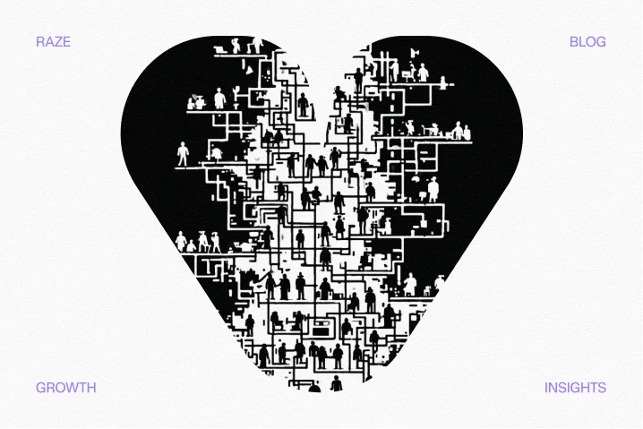
Empathy heart UX design helps SaaS teams move beyond templates by understanding user motivations and friction points to build trust and increase conversions.
Read More